
GMHS Oyster Roast
A fundraising campaign designed to adapt
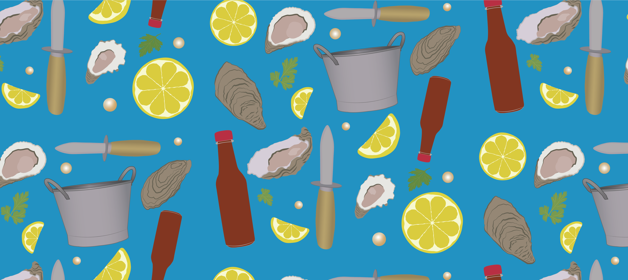
The invitation established the campaign's warm, community-focused identity through original illustration.
OVERVIEW
The Oyster Roast was one of Gloucester-Mathews Humane Society's annual fundraising events, bringing together donors and community members for a casual outdoor gathering that raised money for the organization. When the pandemic forced the 2020 event to change into a take-home experience, the campaign evolved alongside it. I created the visual identity for both years, designing print materials that maintained a cohesive brand while adapting to a completely different fundraising strategy
Role:Visual identity, illustration, and campaign design
Tools: Adobe Illustrator, Adobe InDesign
Year: 2019/2020
-
THE CHALLENGE
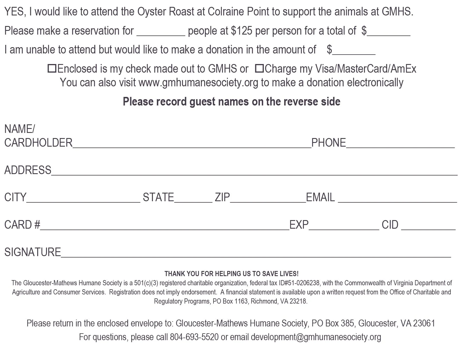
Unlike the annual auction, the Oyster Roast needed to feel relaxed, welcoming, and community-focused rather than formal. I was responsible for creating an identity that could be carried across invitations, response cards, sponsor materials, event signage, and supporting assets while still feeling playful and approachable.
The biggest challenge came the following year when COVID-19 eliminated the in-person event. Rather than abandon the fundraiser, the organization shifted to Oyster Roast To-Go, requiring an entirely new marketing approach that communicated the change while encouraging supporters to continue participating.
THE SOLUTION
I created an original visual identity inspired by vintage travel postcards, mid-century illustration, and café chalkboard graphics, combining those influences into a colorful system that felt friendly, handcrafted, and distinctly different from the organization's other fundraising events.
To support the campaign, I illustrated a library of custom vector artwork—including oysters, lemons, hot sauce, parsley, oyster knives, pearls, and buckets—which became repeating patterns and decorative elements throughout the printed materials. I also designed a companion infographic promoting the shelter's new dental clinic using the same illustration style.
When the event shifted during the pandemic, I adapted the branding into a lower-cost postcard campaign that highlighted adopted shelter pets while teasing the new basket pickup experience. The revised materials established a new cohesive identity while responding to completely different circumstances and budget considerations.
REFLECTION
This project reinforced how important flexibility is in design. Creating a complete visual identity was rewarding, but adapting it during COVID taught me how branding can evolve to meet changing priorities. I'm especially proud of successfully blending several different visual inspirations into one cohesive system and of creating an extensive library of original illustrations that gave the campaign a unique personality.
If I revisited the project today, I would refine some of the typography, but I still think the overall identity captures the warm, community-focused atmosphere the event was meant to create.
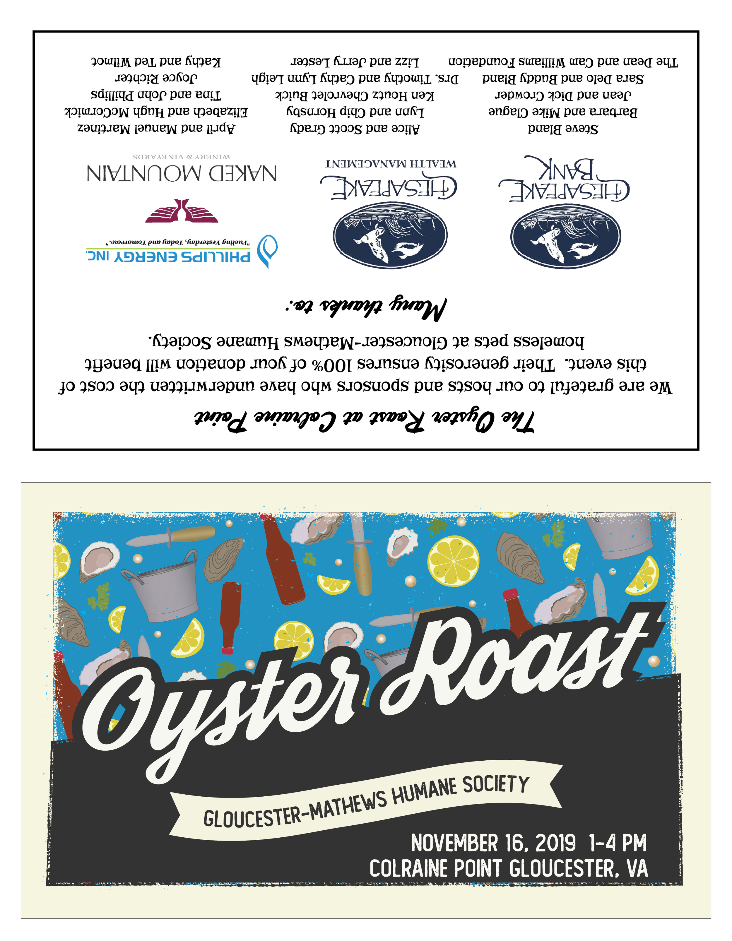
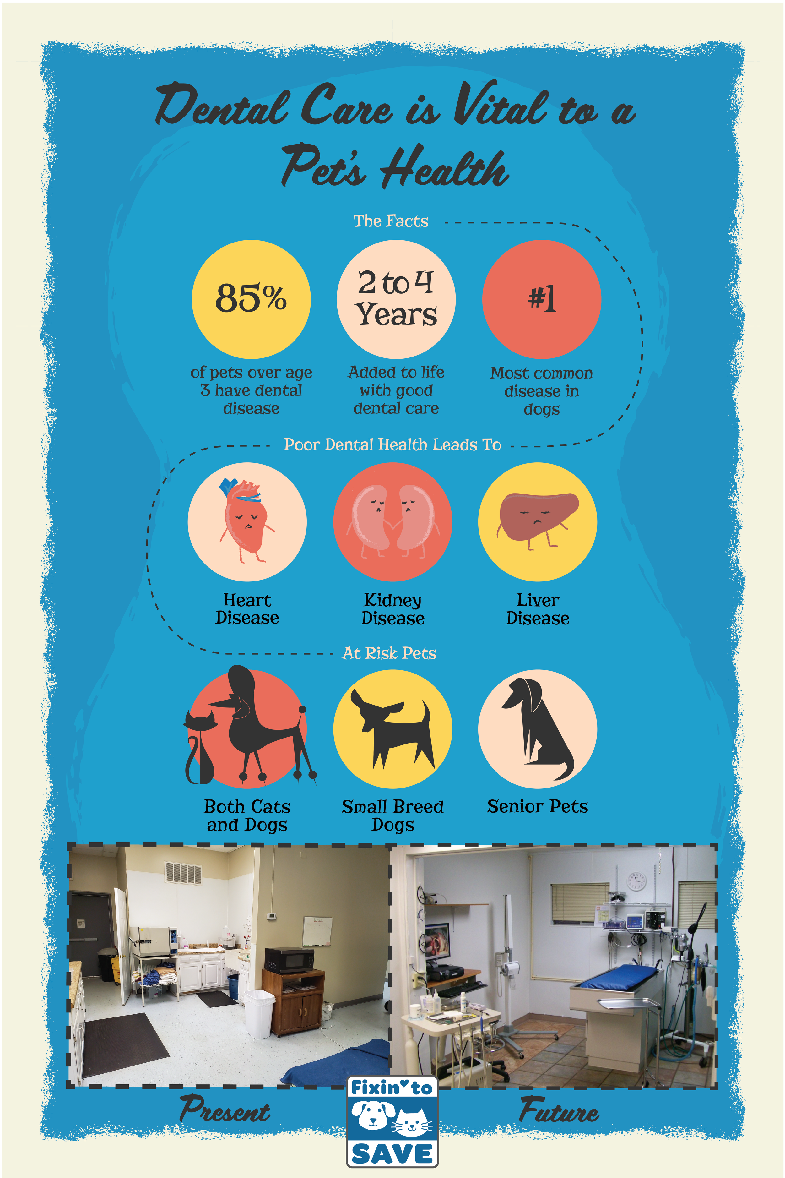
The visual identity drew from vintage travel postcards, mid-century illustration, and café chalkboard graphics.
THE CHALLENGE
Create a welcoming fundraising identity flexible enough to adapt when the event itself completely changed.
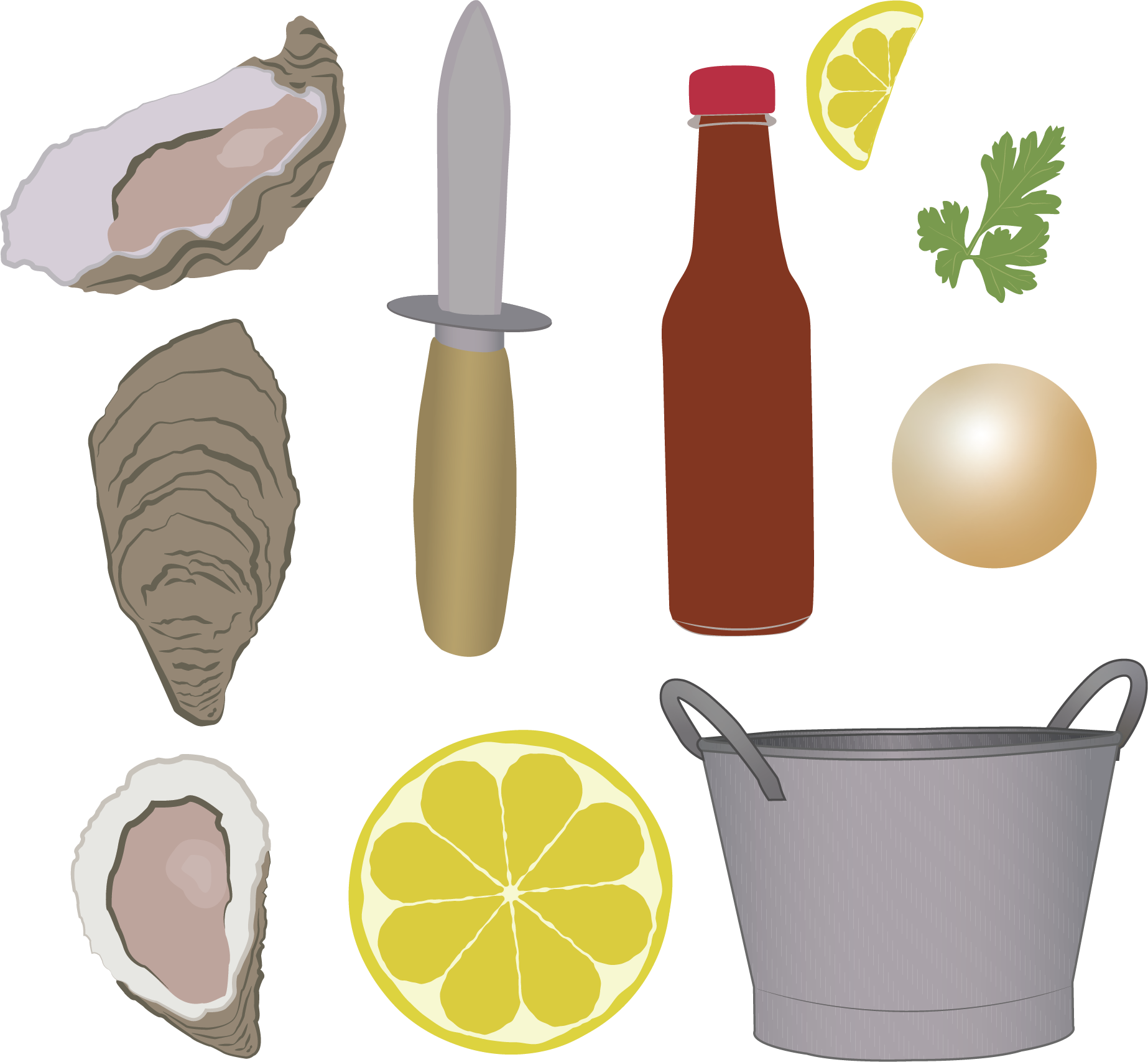
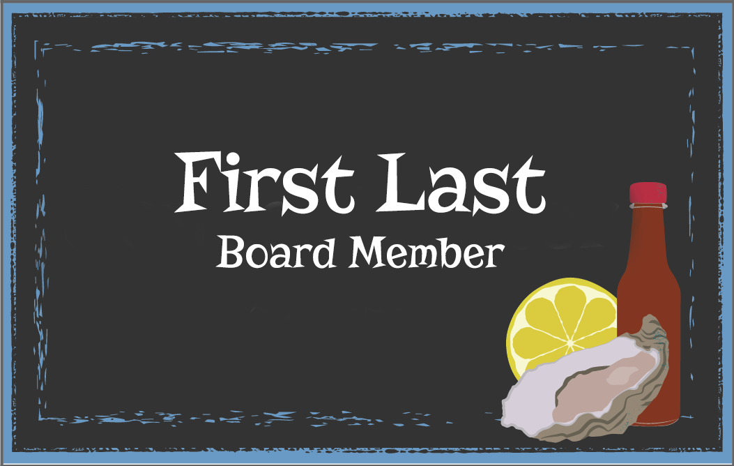
Custom illustrations created a recognizable identity that extended across the campaign.
THE SOLUTION
A library of custom illustrations created a flexible visual system that could evolve with the fundraiser.
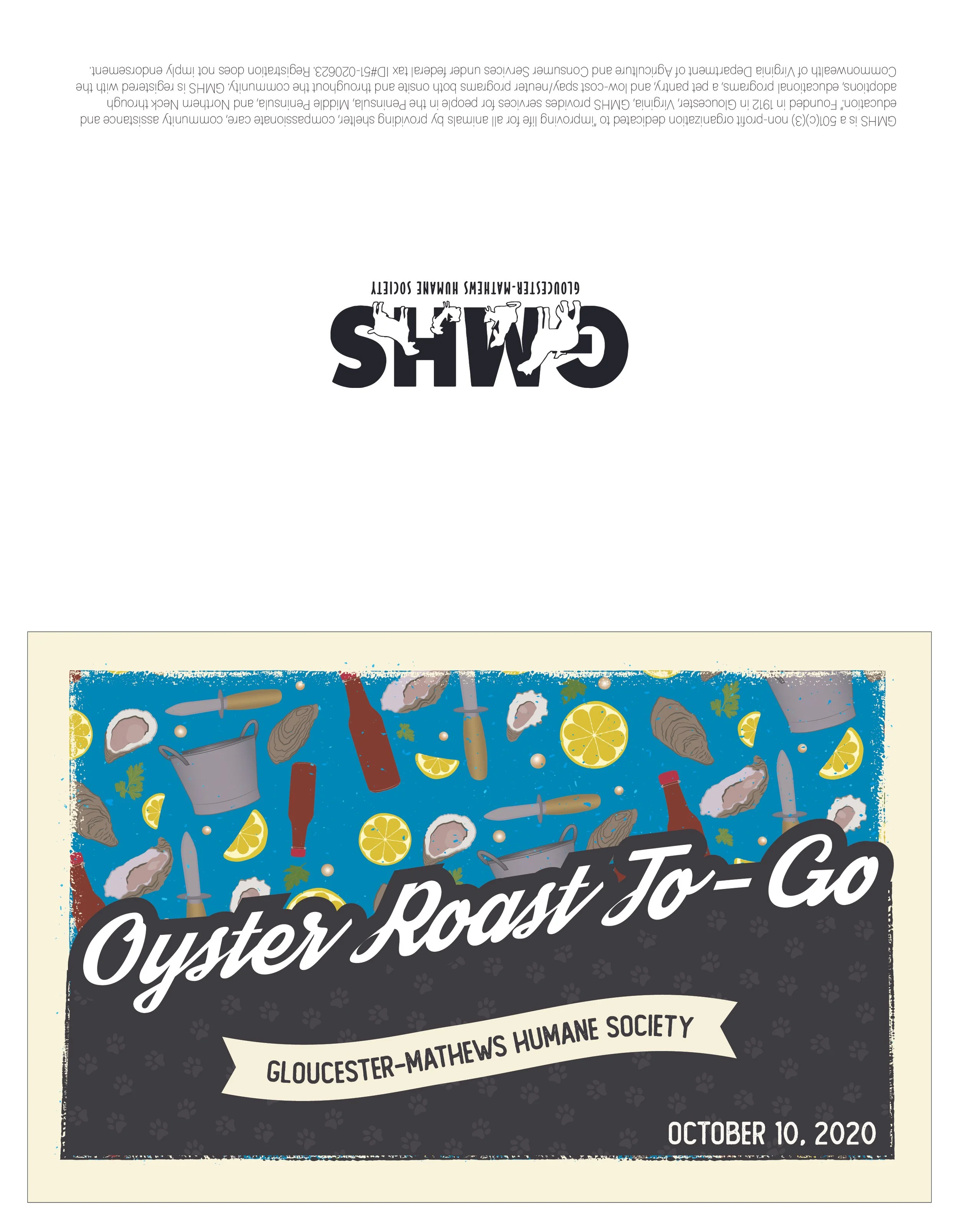
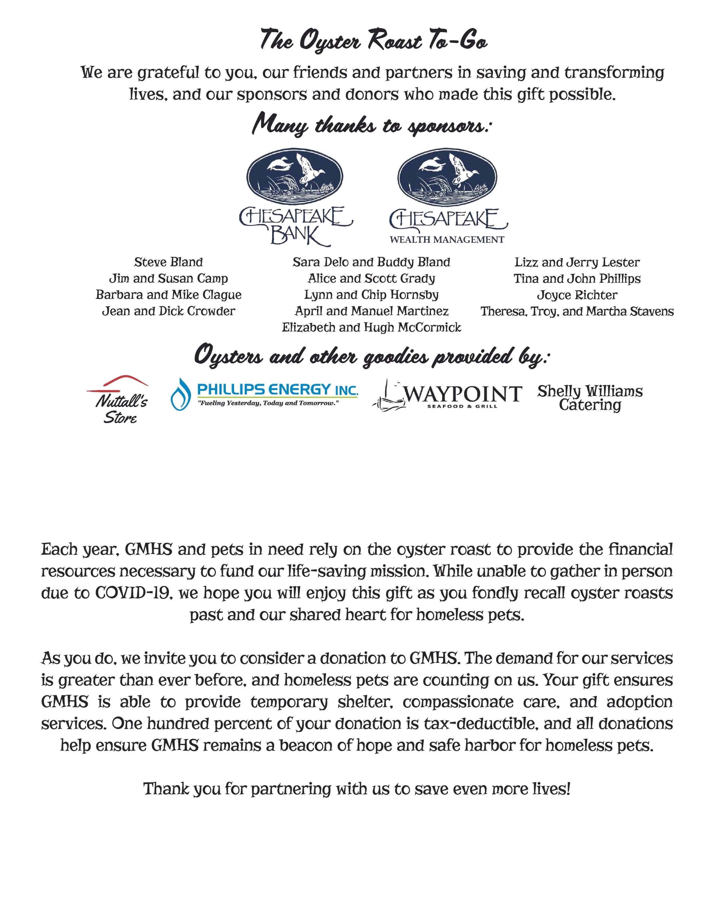
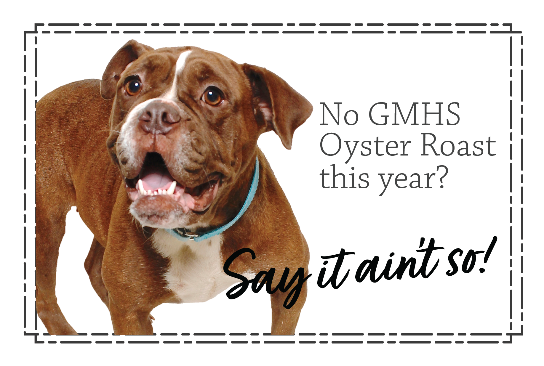
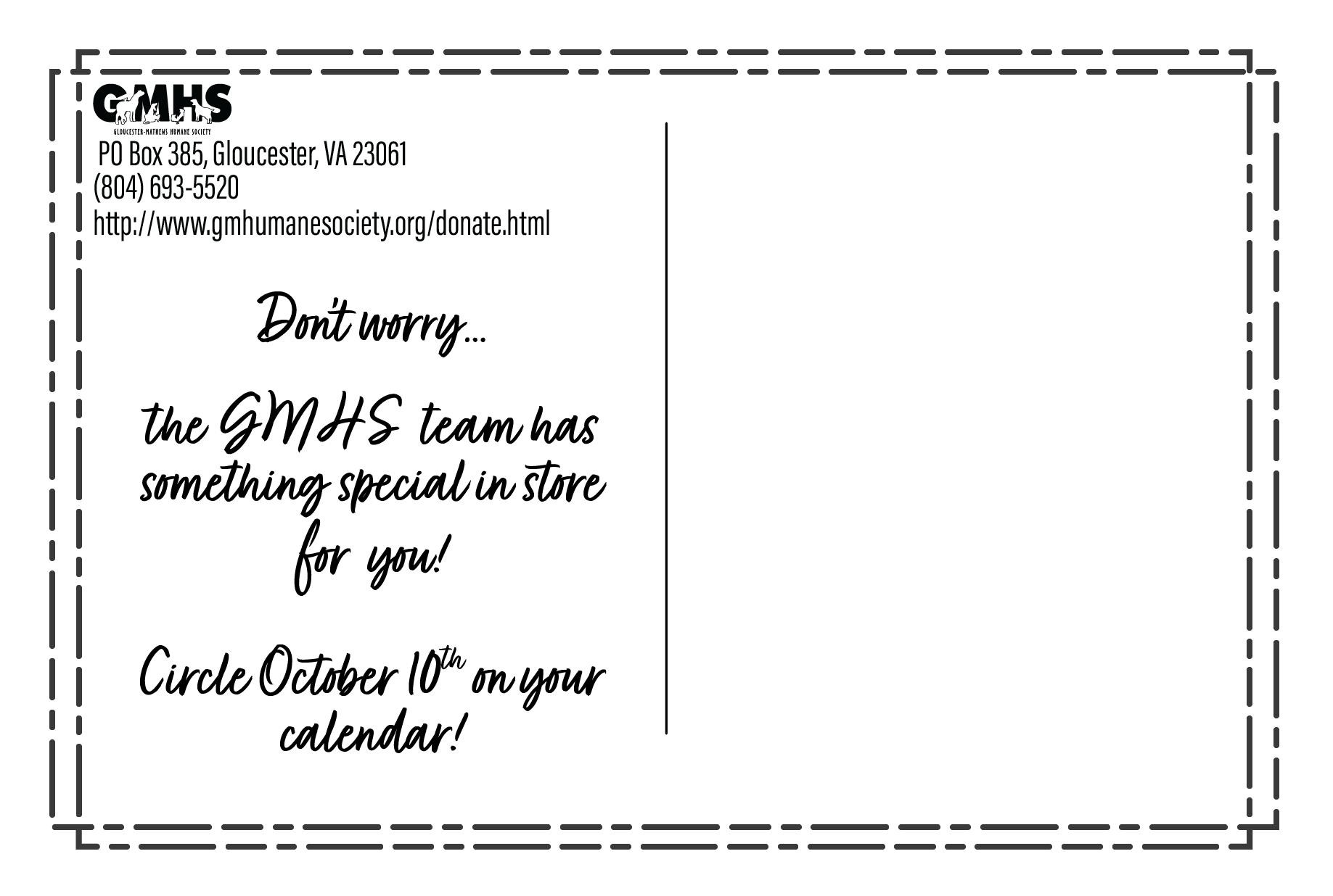
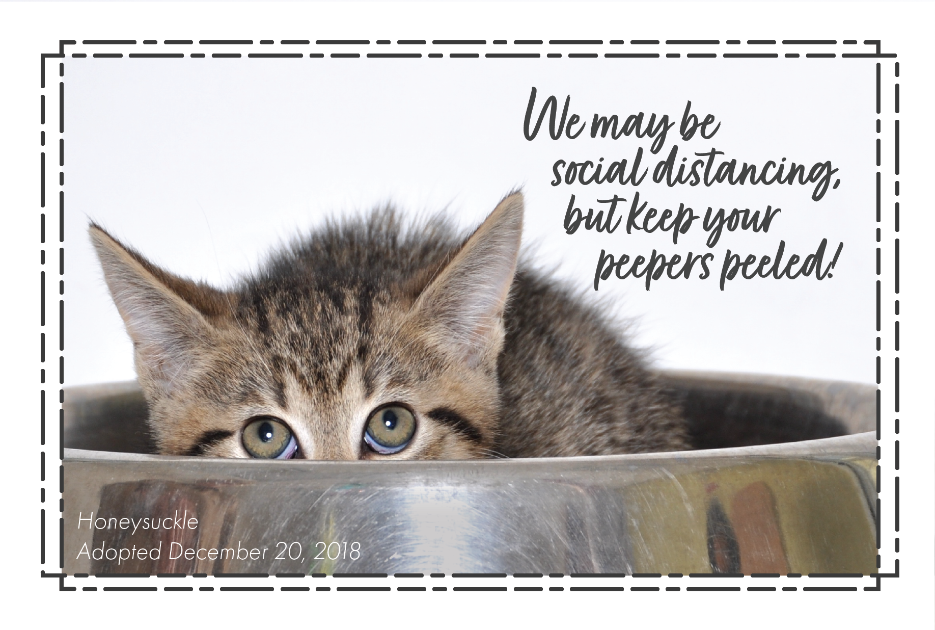
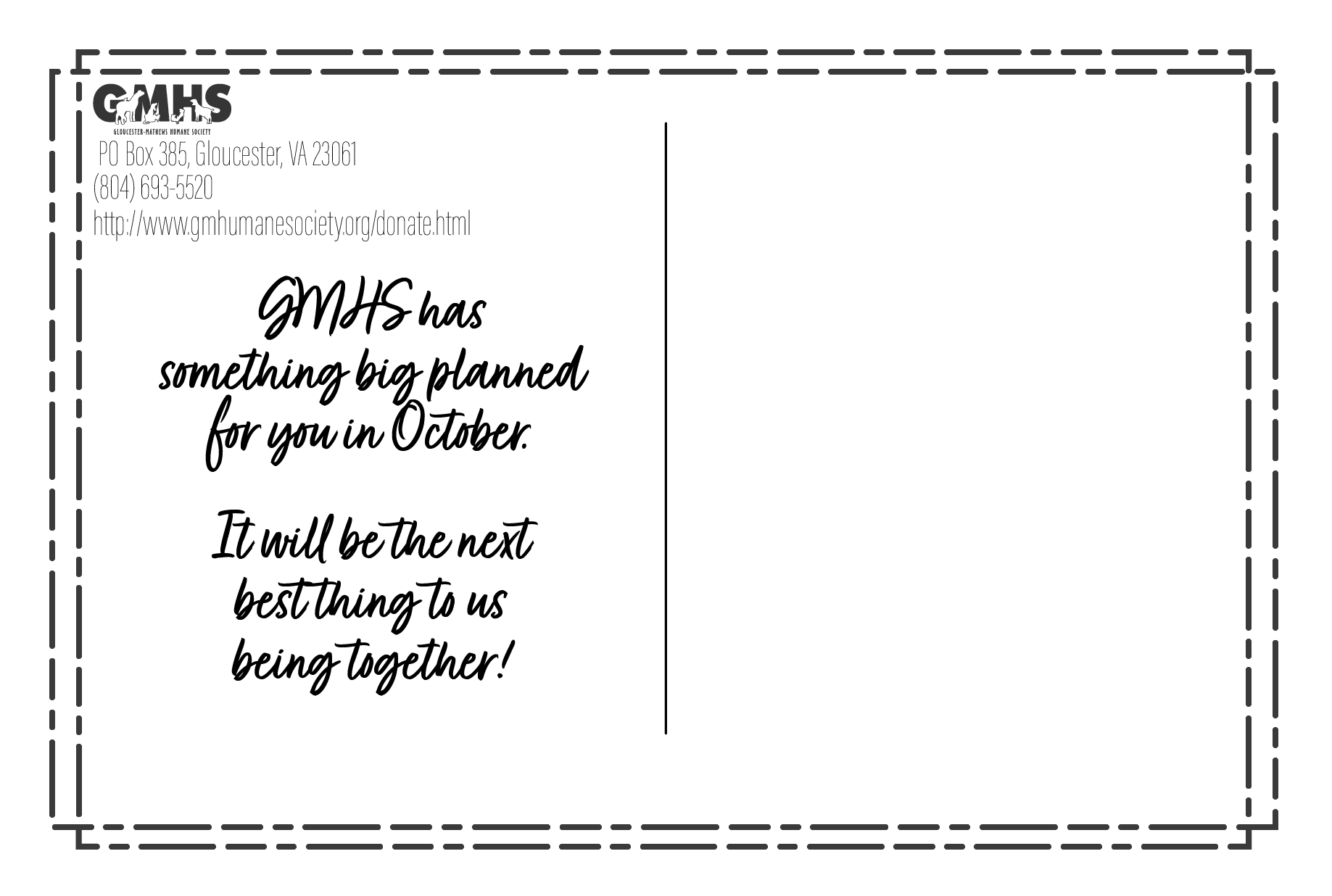
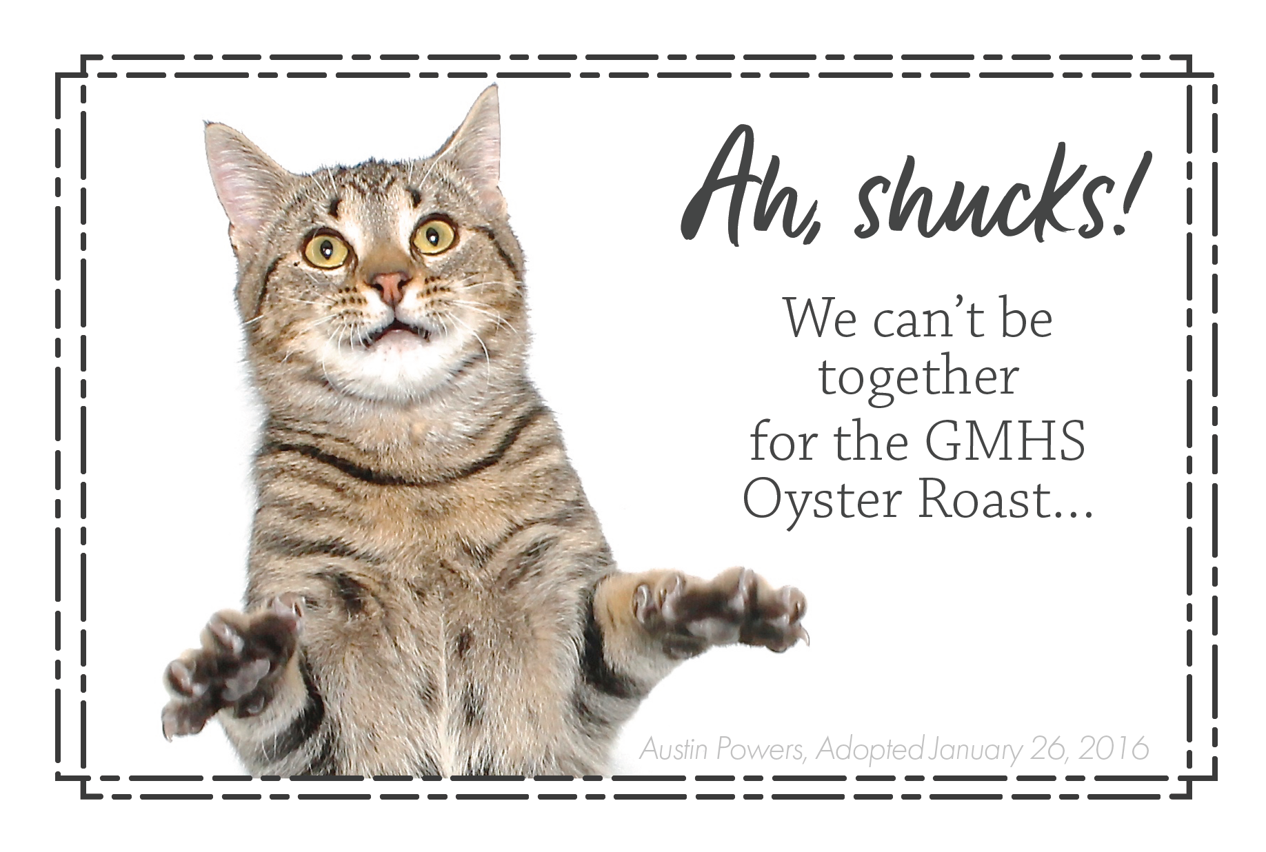
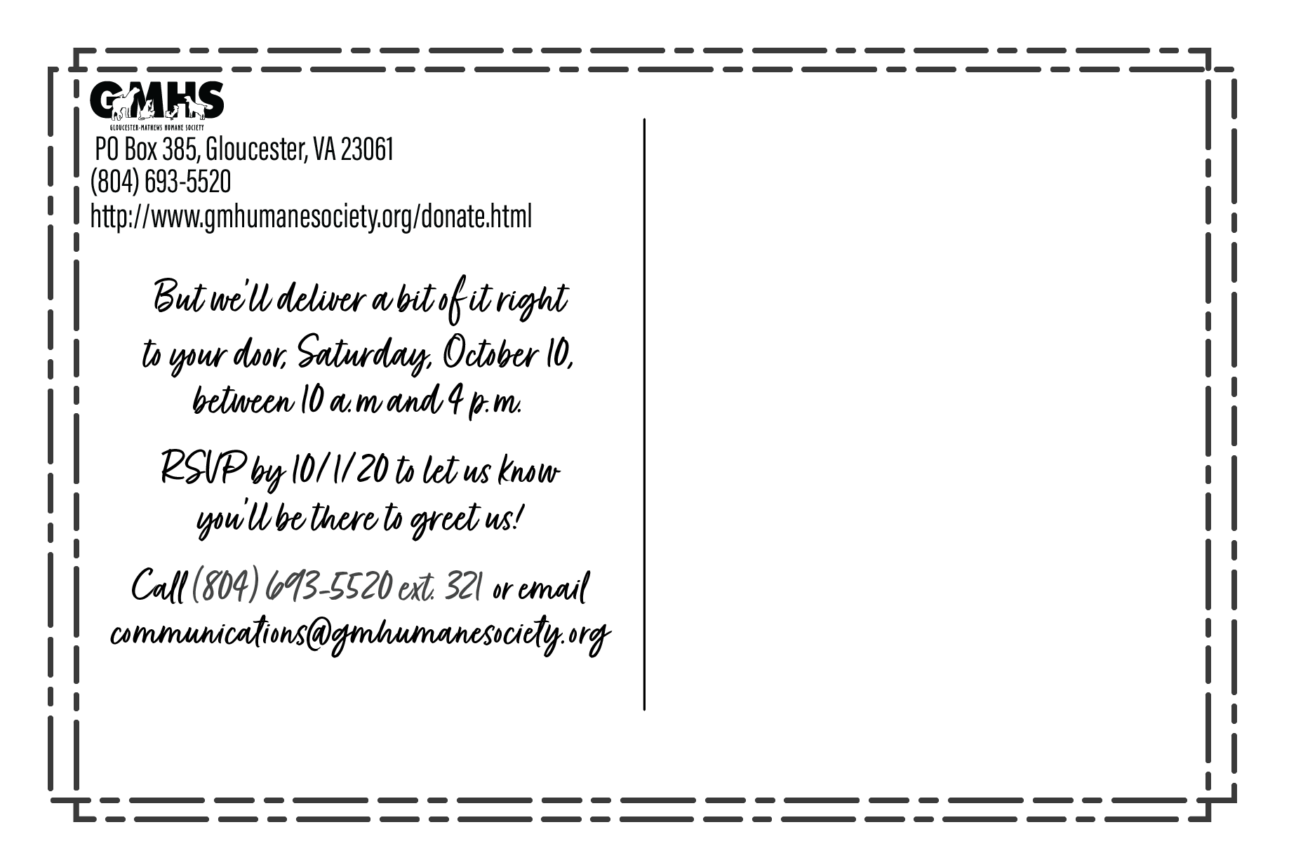
When the event shifted during the pandemic, the identity adapted into a lower-cost postcard campaign without losing visual continuity.
REFLECTION
The project showed me how a strong identity can evolve without losing what makes it recognizable.
A library of original vector illustrations became reusable assets across print materials, signage, and later adaptations of the campaign