

Dogs Day Out
Creating a cohesive brand identity for a community adoption initiative
OVERVIEW
Dogs Day Out was a Gloucester-Mathews Humane Society volunteer program designed to increase adoption visibility by giving shelter dogs opportunities to spend time in the community. I developed a friendly, flexible identity that helped make the new initiative recognizable across its various applications.
Role: Visual identity, illustration, and print design
Tools: Adobe Illustrator
Year: 2019
-
THE CHALLENGE
Dogs Day Out was more than a dog-walking program—it was designed to encourage adoptions by introducing shelter dogs to potential adopters in everyday community settings. Volunteers needed materials that could quickly communicate important information about each dog, while the program itself needed branding that would be memorable, approachable, and flexible enough to work across multiple printed pieces.
Because the initiative was brand new, there were no existing visual guidelines. I was responsible for developing the entire identity, from logo design to supporting materials, while ensuring everything felt welcoming to both volunteers and families considering adoption.
THE SOLUTION
I designed a bright, outdoor-inspired visual system centered around a friendly seal-style logo featuring a dog wearing sunglasses against a sunny sky. The logo was intentionally simple so it could scale well across business cards, kennel signage, apparel, and future promotional materials.
Beyond the logo, I created a coordinated set of printed materials that volunteers could use during outings, including information cards with handwritten fields for each dog's name, breed, age, and personality notes. I also designed matching kennel signs and a colorful volunteer t-shirt graphic built from multiple logo color variations, giving the campaign a playful personality while maintaining consistent branding throughout.
One of the biggest design decisions came during the logo process. Early concepts incorporated the phrase "Share Joy," but I felt the additional text made the design feel overcrowded. After several revisions, the executive director agreed, and simplifying the logo resulted in a much stronger and more versatile identity.
Later, the illustrated dog was adapted for the shelter's Bow Wow & Meow 5K fundraising event, extending the visual language beyond the original campaign.
REFLECTION
Dogs Day Out reinforced one of the most valuable lessons I've learned as a designer: sometimes the best solution comes from continuing to push beyond the first acceptable idea. Although the initial concepts would have satisfied the project's requirements, I knew they could be stronger. Taking the time to simplify the logo and refine the overall branding resulted in a much more cohesive system.
This project also demonstrated how a single visual identity can successfully extend across multiple printed materials while remaining recognizable and approachable. It's one of my favorite nonprofit branding projects because it combines illustration, logo design, layout, and practical print design into a unified campaign.
A simple, flexible logo designed to become the foundation of the Dogs Day Out brand
THE CHALLENGE
Create an approachable identity for a new adoption initiative that could quickly communicate information about shelter dogs while working across a variety of volunteer materials.
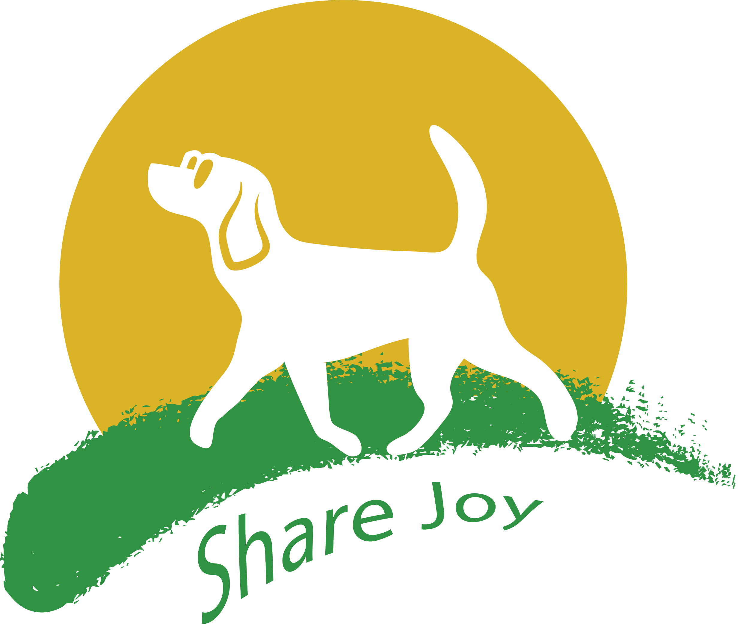
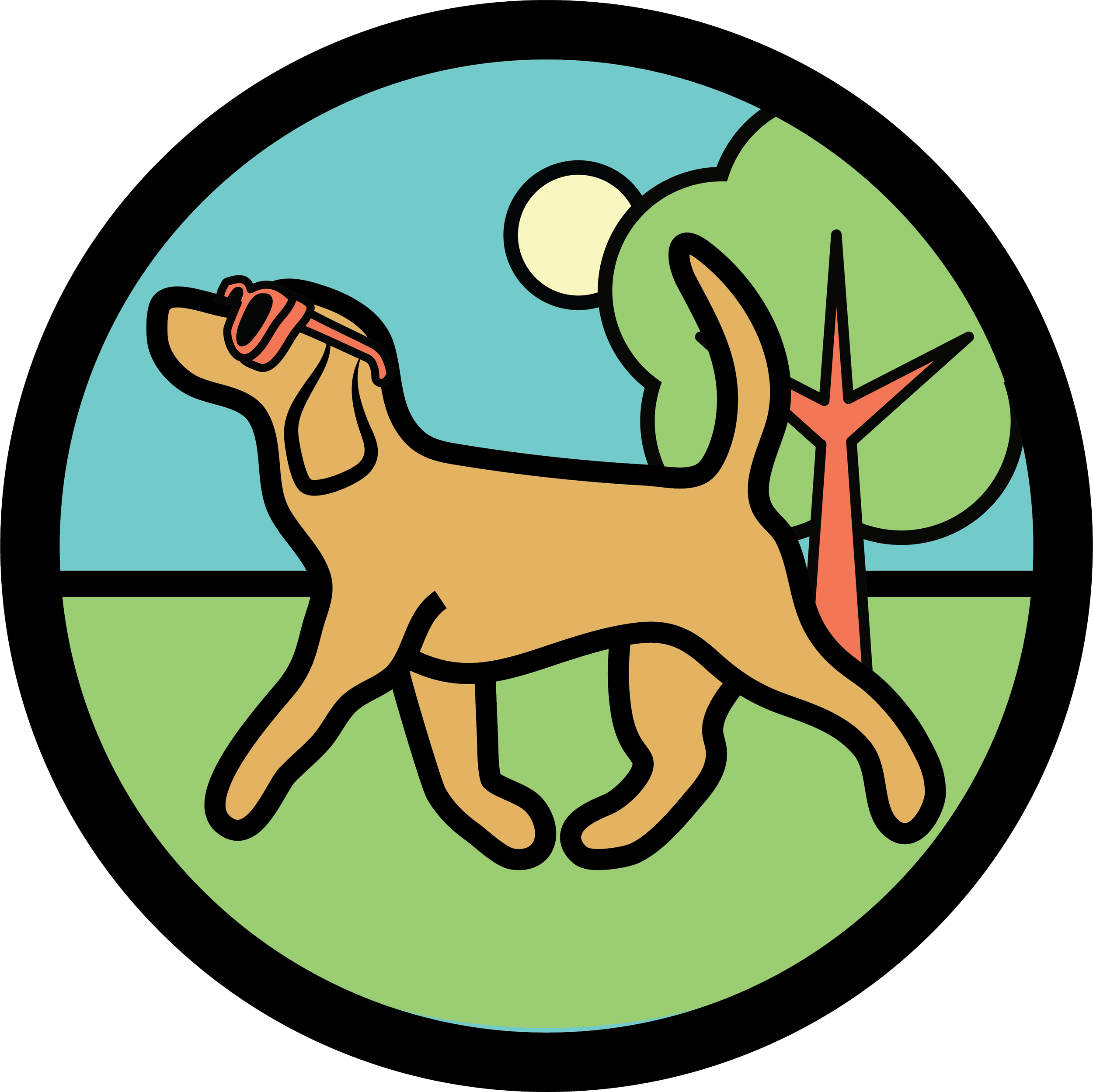
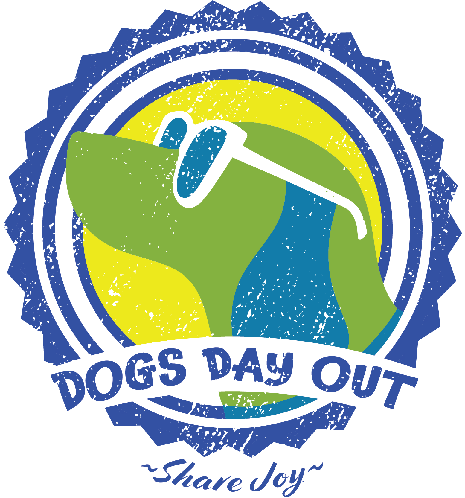
Early explorations tested different layouts, messaging, and illustration styles before simplifying the identity into the final seal-inspired logo
THE SOLUTION
A bright, outdoor-inspired identity paired a friendly illustrated logo with a flexible system that extended across informational cards, kennel signage, volunteer apparel, and merchandise.
The identity expanded into practical print materials that volunteers used to introduce adoptable dogs throughout the community
Multiple color variations of the logo were combined into a bold pop art-style volunteer t-shirt design that also became merchandise for the shelter
REFLECTION
Dogs Day Out reinforced the value of pushing beyond the first acceptable idea, with continued refinement ultimately producing a simpler, stronger, and more versatile identity.
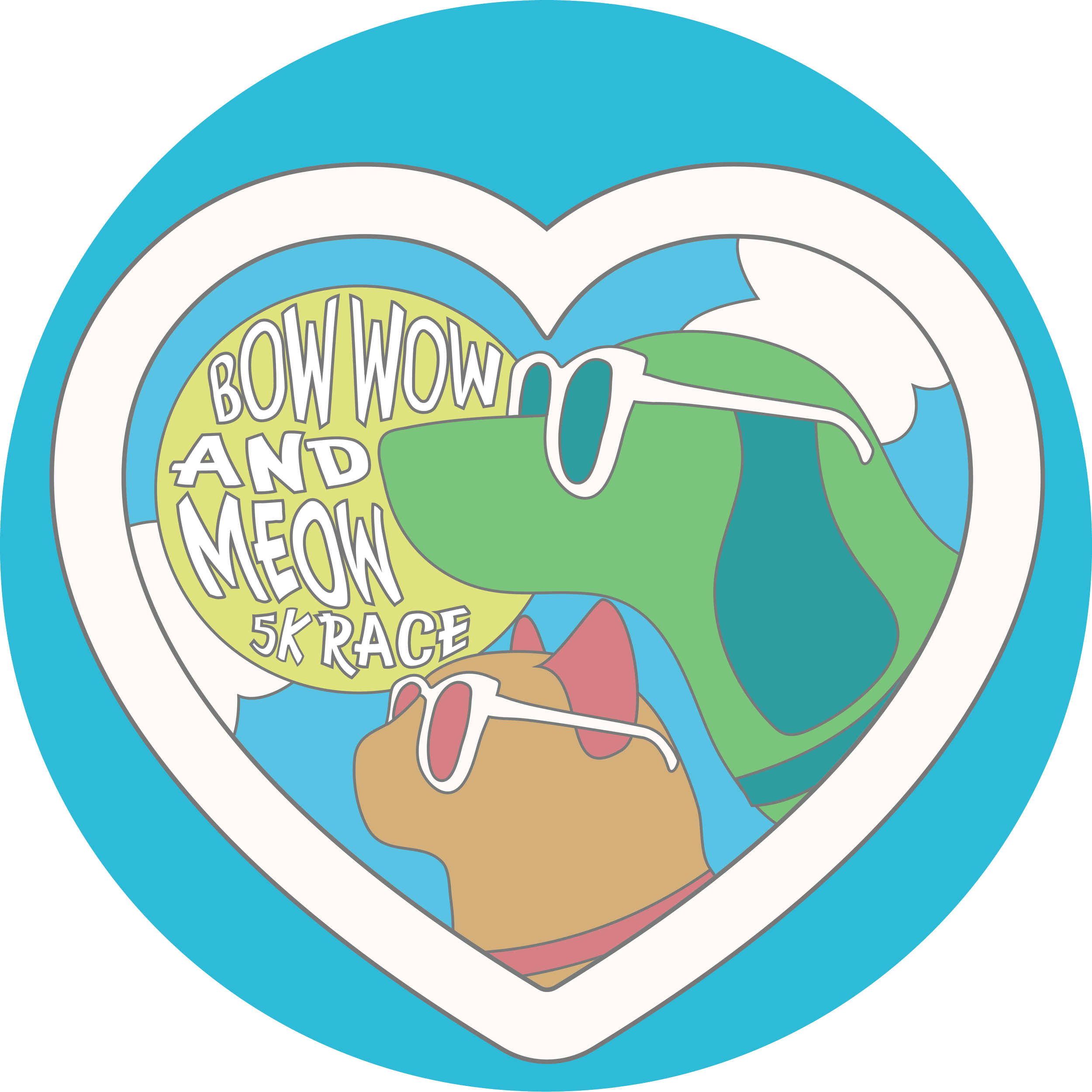
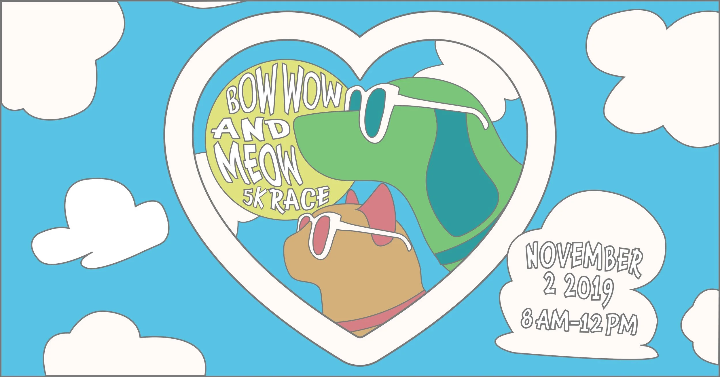
The Dogs Day Out illustrations were later adapted for additional shelter initiatives, extending the visual identity beyond the original campaign