

United in Progress
A political apparel design created to communicate optimism, unity, and forward momentum
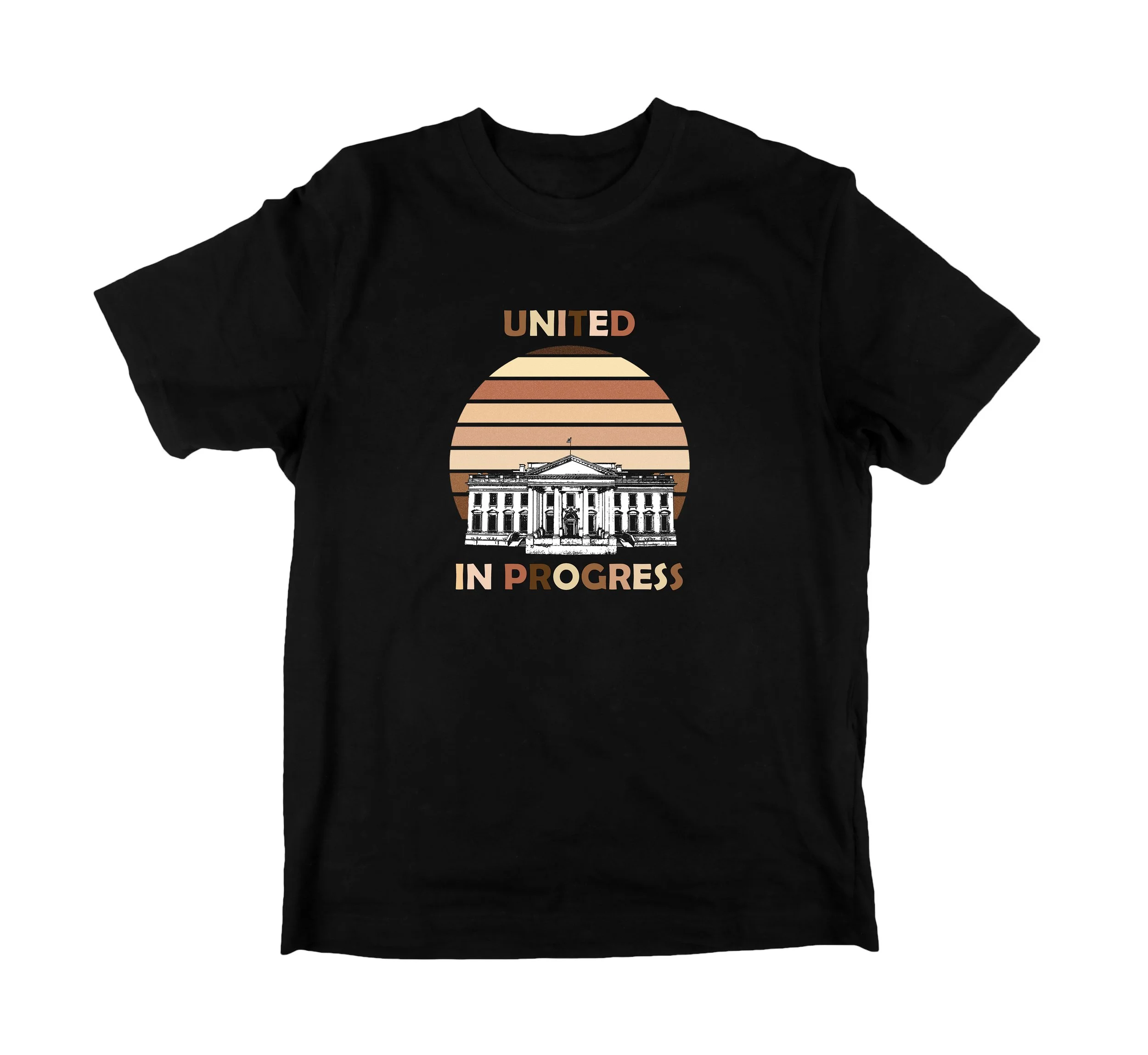
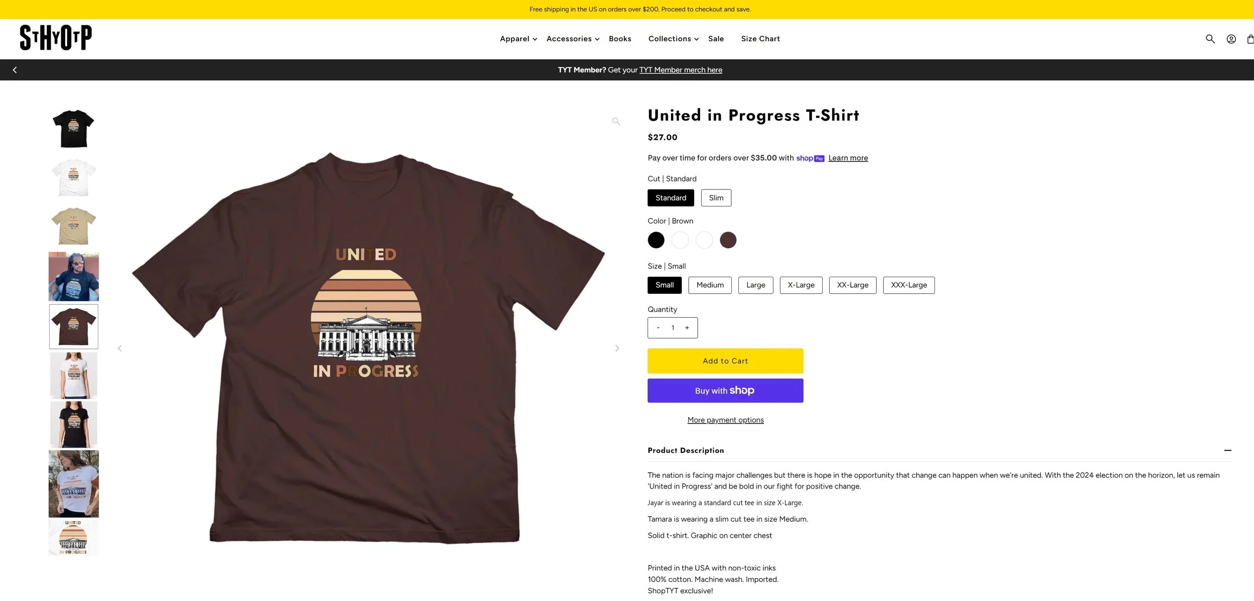
Final "United in Progress" T-shirt celebrating hope, unity, and progress through a clean, symbolic graphic
Overview
United in Progress was my first merchandise design created for TYT shortly after the 2020 U.S. election. The goal was to celebrate a new political chapter without centering the design on a specific politician, allowing the artwork to remain relevant beyond a single moment in time.
The design was sold through the ShopTYT store on T-shirts and tank tops, and became one of the network's featured merchandise launches.
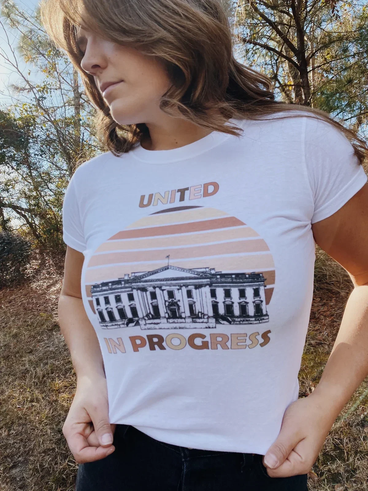

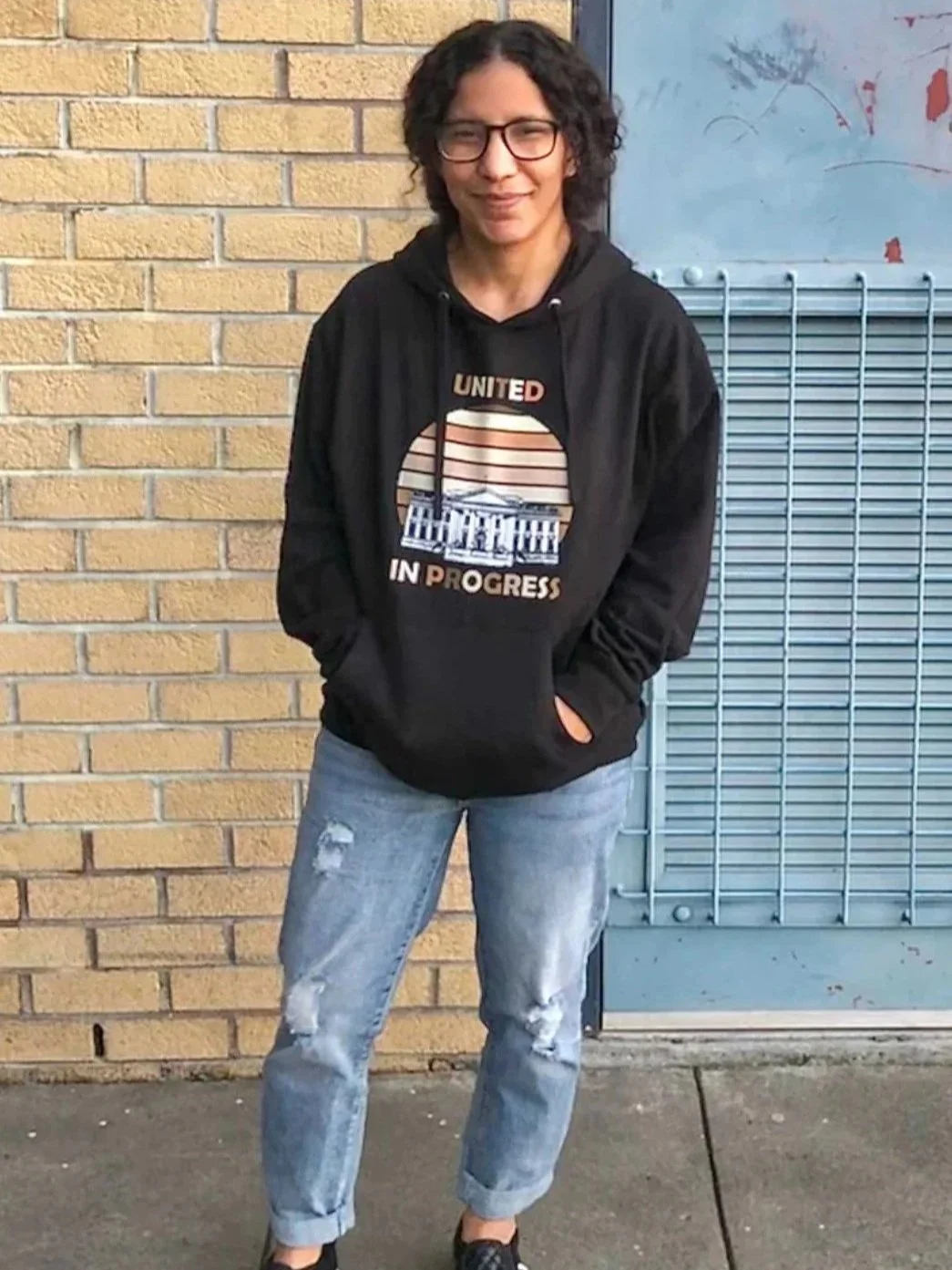
The design was produced in multiple apparel colorways and styles for the ShopTYT merchandise store
The Challenge
The brief was intentionally broad: create a design that reflected hope, unity, and progress following the election while avoiding imagery or messaging that felt overly partisan or tied to one individual.
I explored multiple concepts, including a map of the United States rendered in a range of skin tones and several different slogans. The biggest challenge was finding a visual language that communicated political optimism without becoming confrontational or divisive.
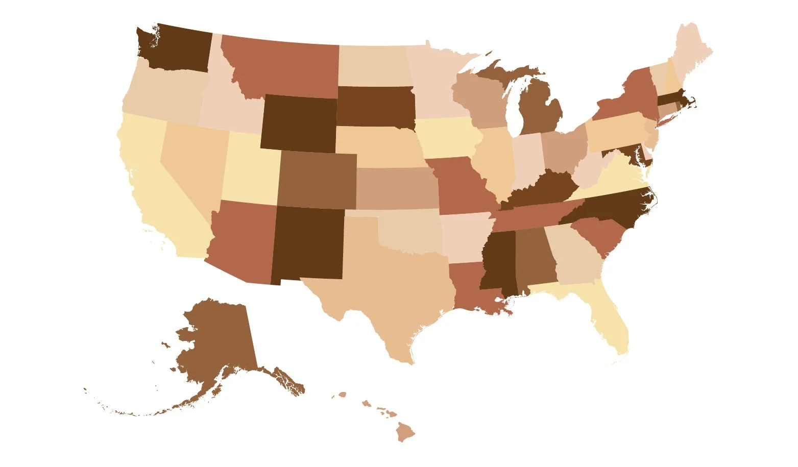
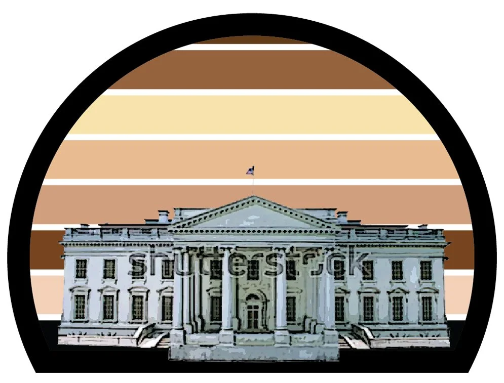
Early concept exploration comparing two visual approaches to communicating unity and progress before selecting the final direction
The Solution
I developed a minimalist illustration of the White House silhouetted against a rising sun composed of horizontal bands representing a spectrum of skin tones. The sunrise symbolized a new beginning, while the diverse color palette reinforced the idea of unity.
Rather than using the suggested slogan, "We Did It!", I proposed "United in Progress." The phrase better reflected TYT's identity as a progressive news network while giving the design a more timeless message.
To reinforce the clean, optimistic aesthetic, I paired the illustration with bold sans serif typography and a restrained color palette that translated well to apparel printing.
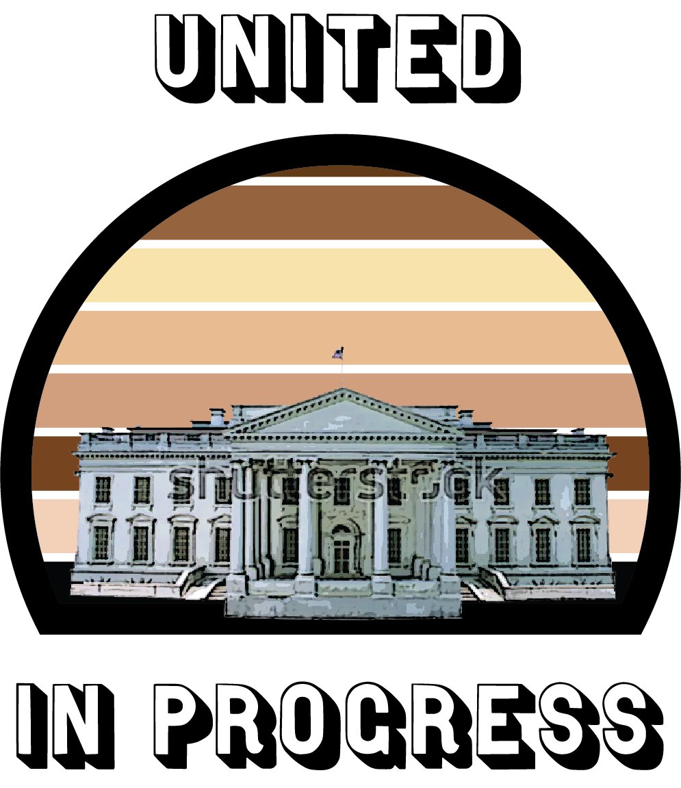
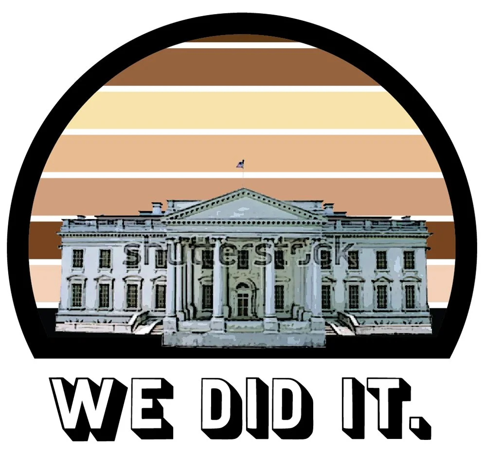

Once the White House concept was selected, I refined the graphic, messaging, and typography before arriving at the final design
Reflection
This project introduced me to TYT's merchandise design process from concept through production and marketing. Although it was my first apparel design for the company, it became a heavily promoted release and was even featured in a magazine.
Looking back, I might refine the relationship between the White House illustration and the graphic style of the rising sun, but I'm still proud of how effectively the design communicates a hopeful message using relatively simple visual elements.
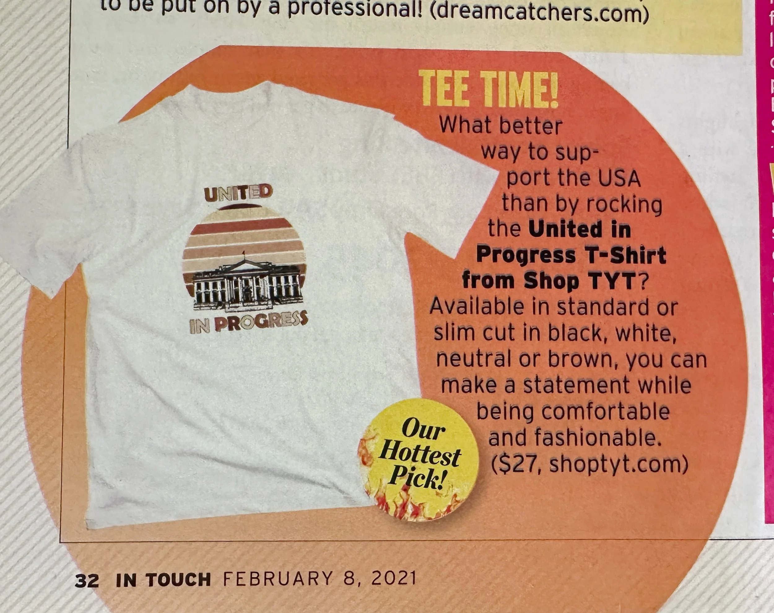
The finished design was promoted through ShopTYT marketing materials and was featured in In Touch Weekly, making it one of my first widely distributed merchandise projects