
Riders in the Storm
A temporary network rebrand inspired by retro sci-fi aesthetics
Overview
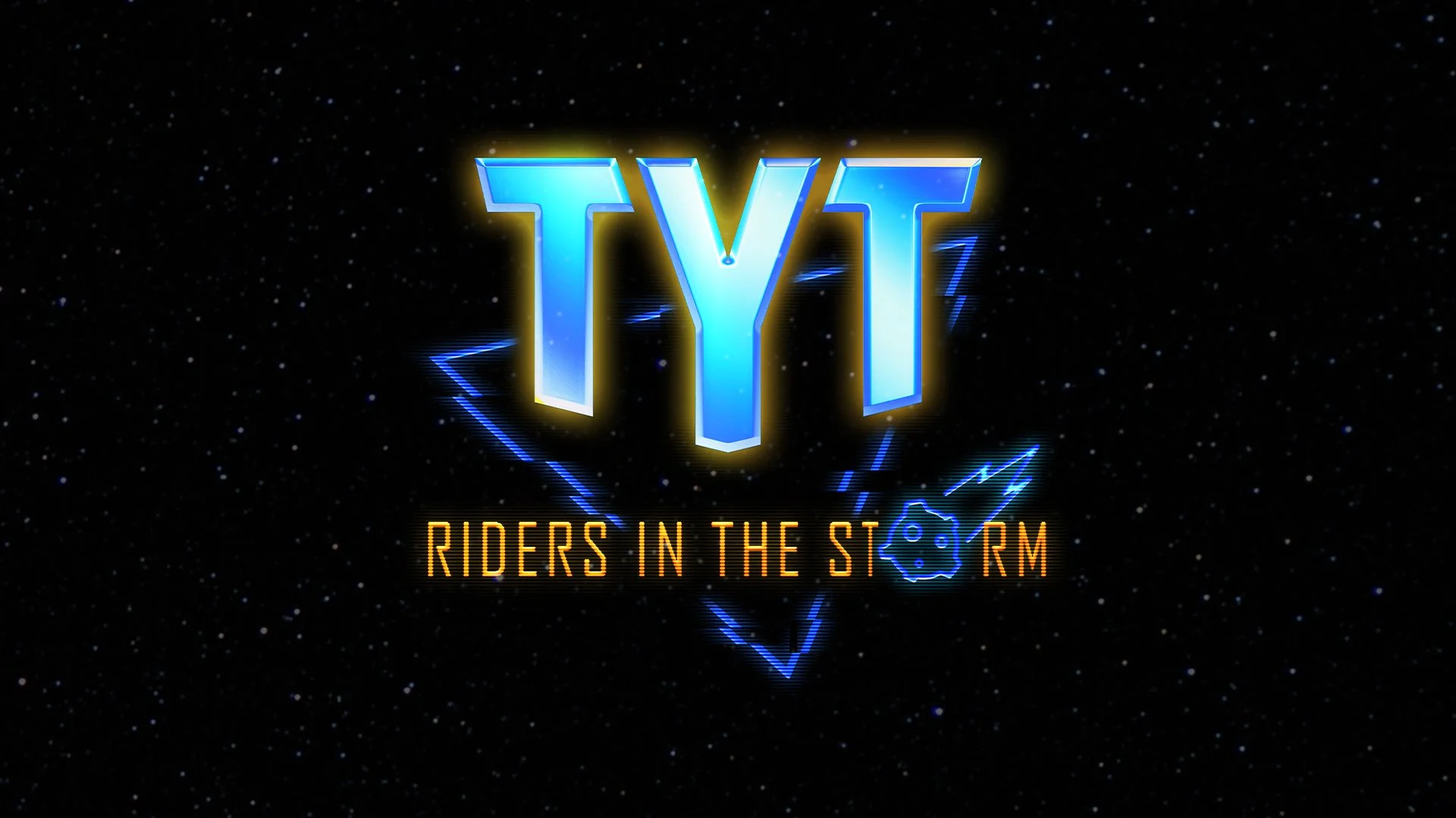
Riders in the Storm was a temporary network rebrand created to communicate TYT's resilience during an increasingly difficult media and political landscape. Originally pitched as a single promotional graphic, the project evolved into a year-long network branding campaign spanning marketing, social media, merchandise, and broadcast graphics.
I led the visual identity from concept through final execution, developing the branding and adapting it across approximately 50 campaign assets.
The Challenge
The project began with only a loose creative brief calling for a retro, 80s-inspired aesthetic and the phrase "TYT Forever." After presenting my initial concepts, the scope expanded into a full network rebrand with the new title Riders in the Storm.
Design Exploration
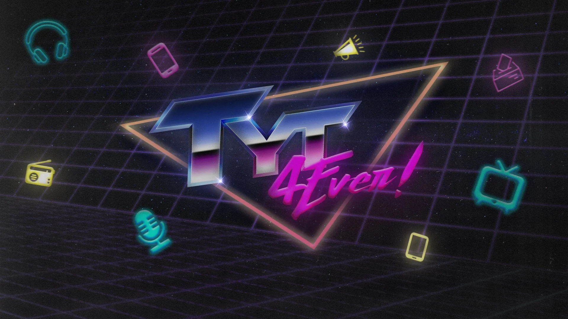
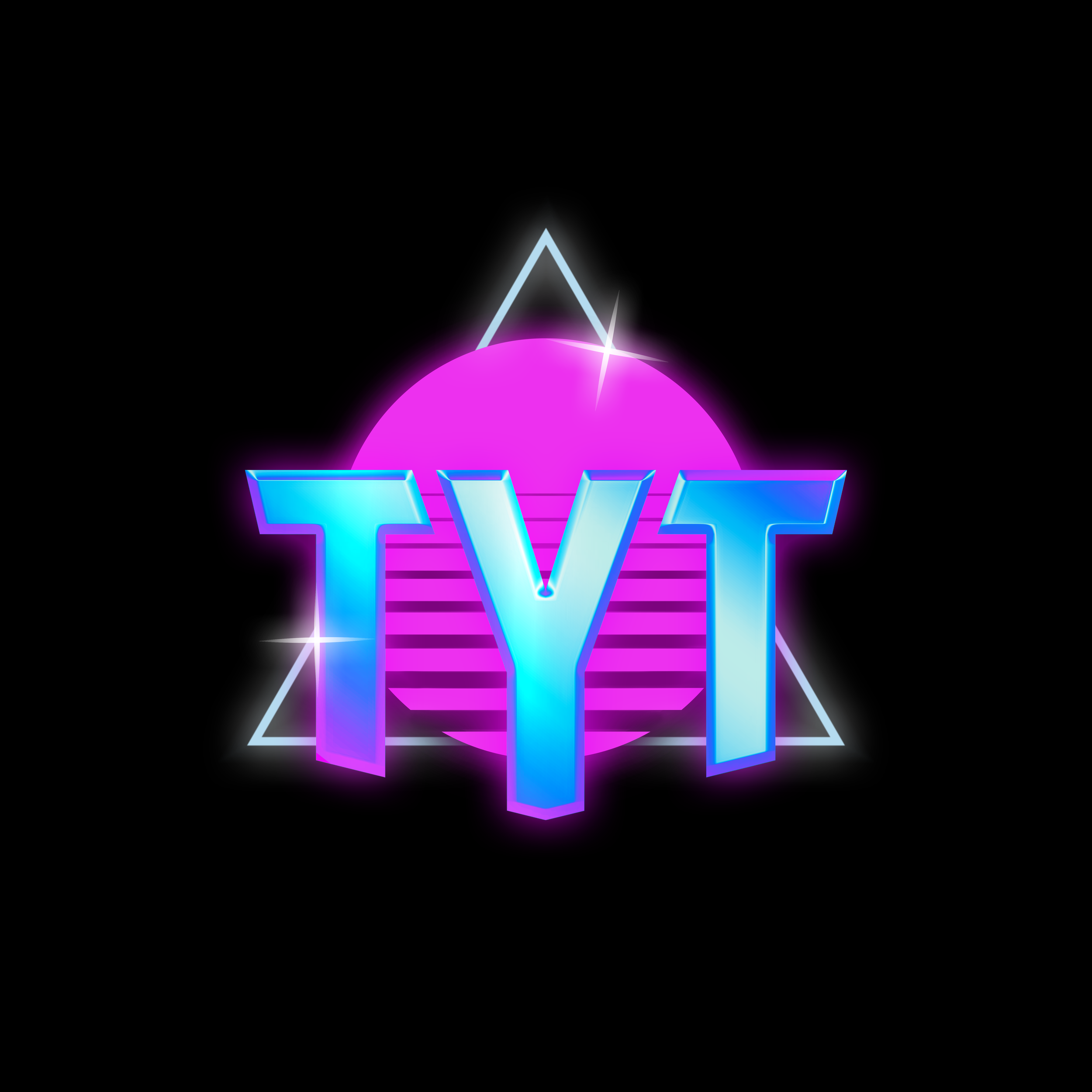
Early concepts that featured a more 80’s retrowave inspired aesthetic, and the tagline “TYT Forever”
The direction continued to evolve through several rounds of feedback. While the marketing team favored a simpler approach, executive leadership pushed for a more futuristic, digital aesthetic. My role was to refine the identity while balancing competing creative perspectives and maintaining a cohesive visual system.
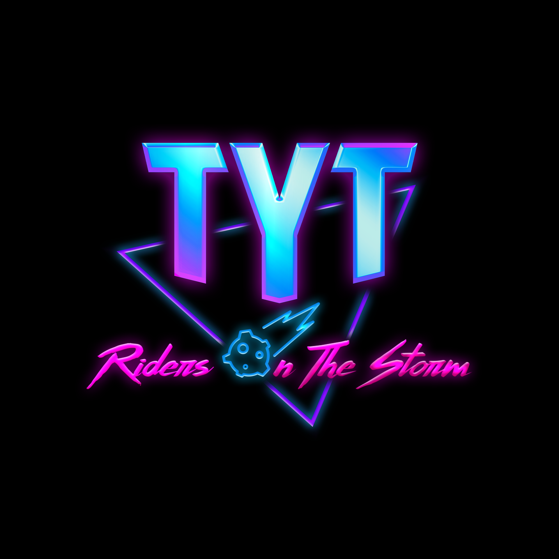
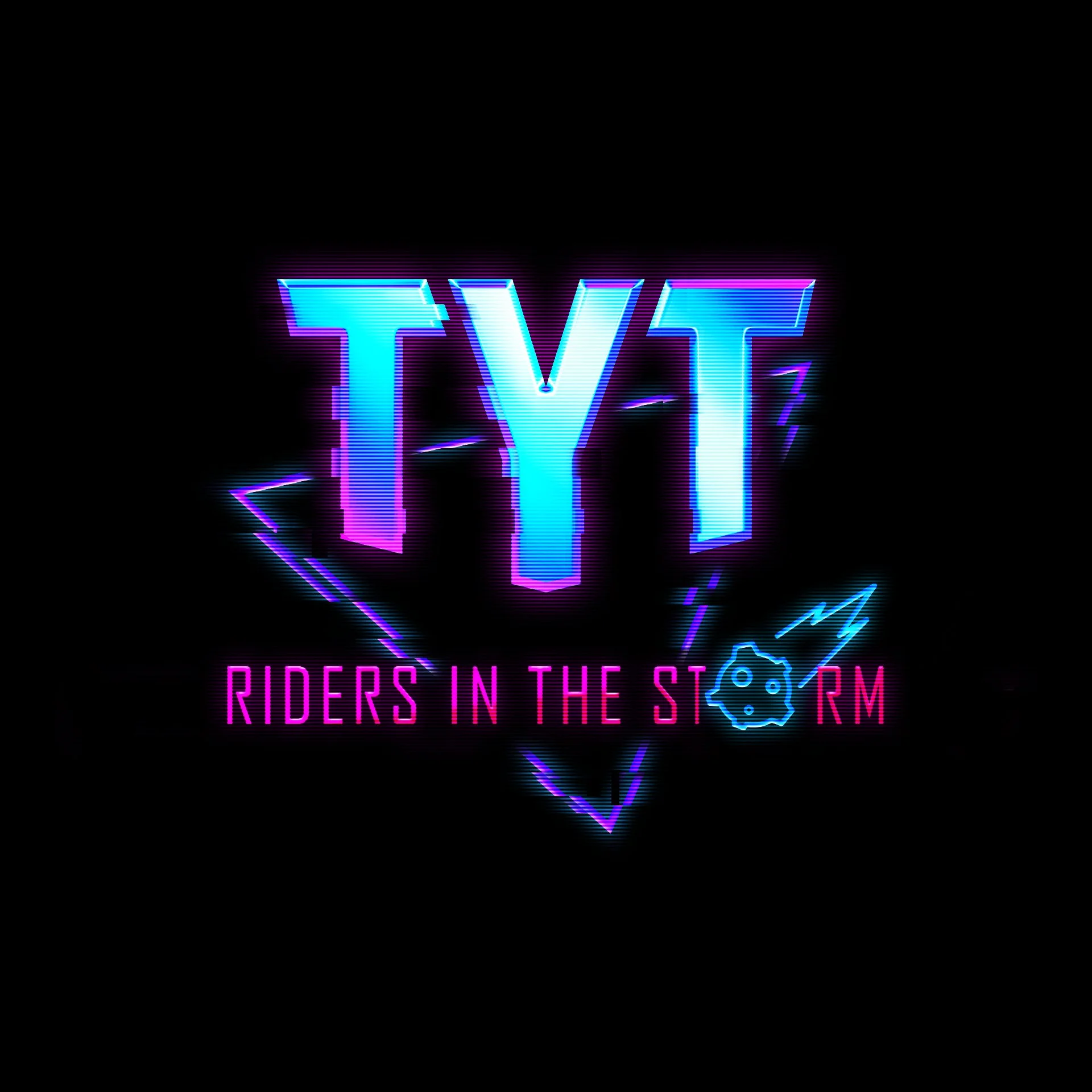
The design was simplified and the tagline became “Riders on the Storm”. Then “on” was changed to “in” and I refined the design with a glitch effect and scanlines.
The Solution
The final identity blended chrome typography, geometric shapes, glitch effects, and sci-fi influences into a distinctive visual language that reflected the campaign's message of resilience.
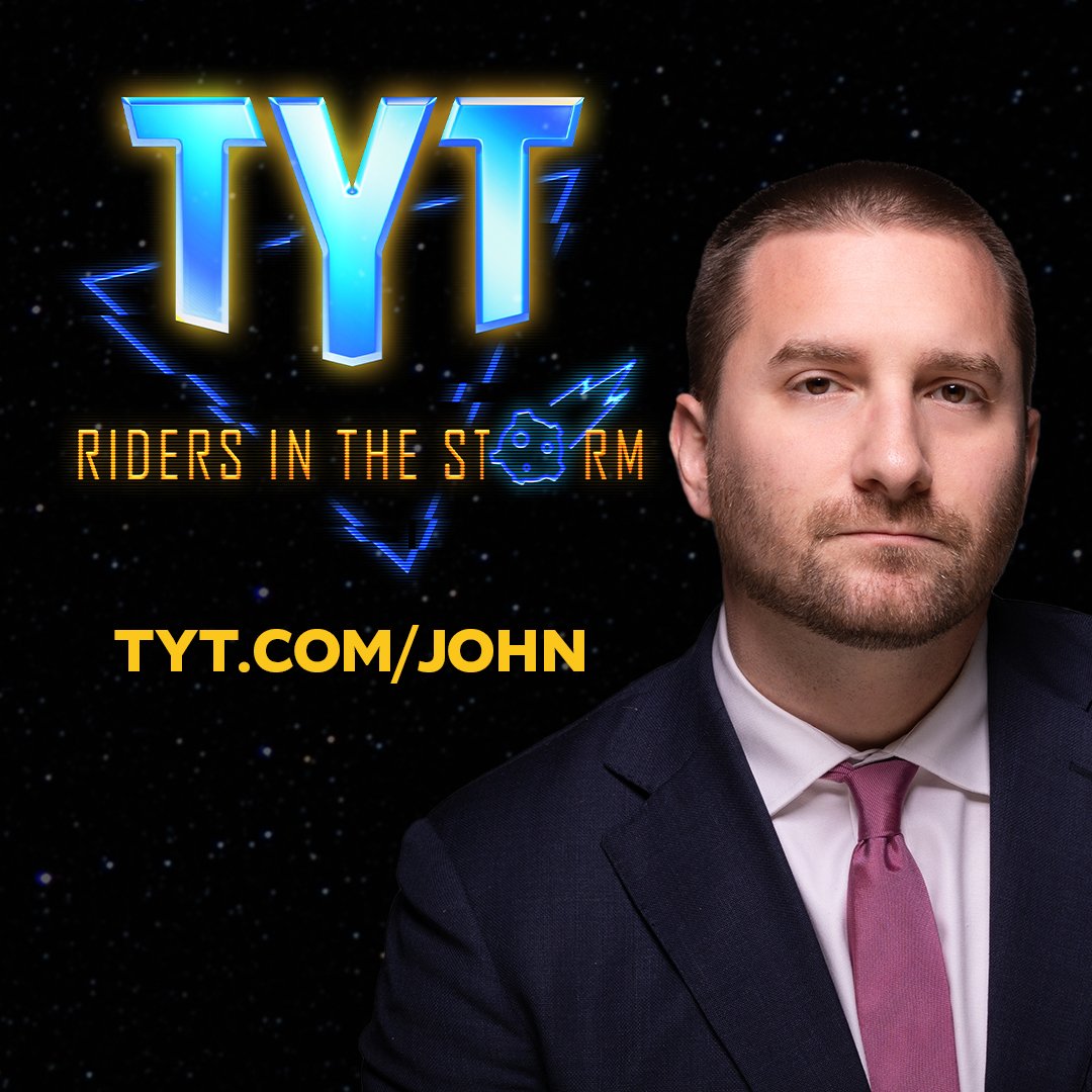
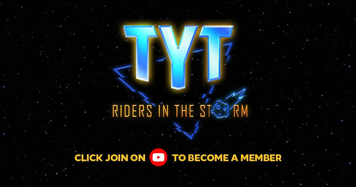
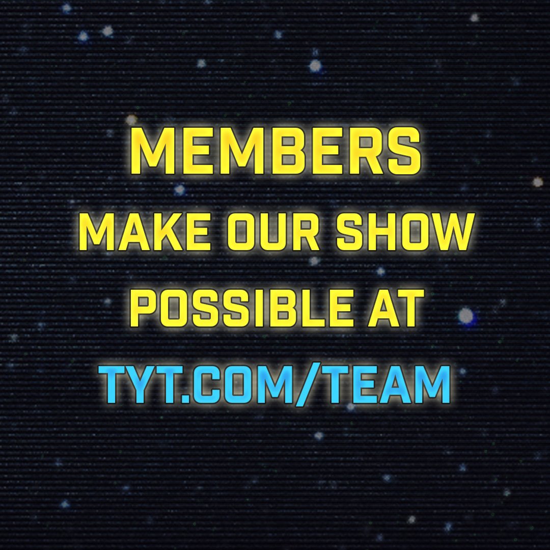
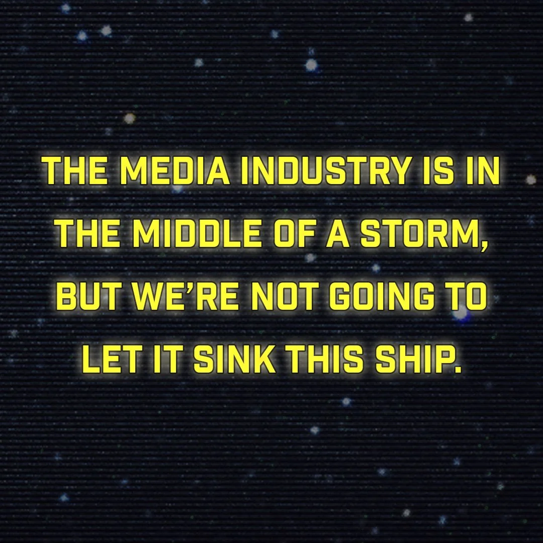
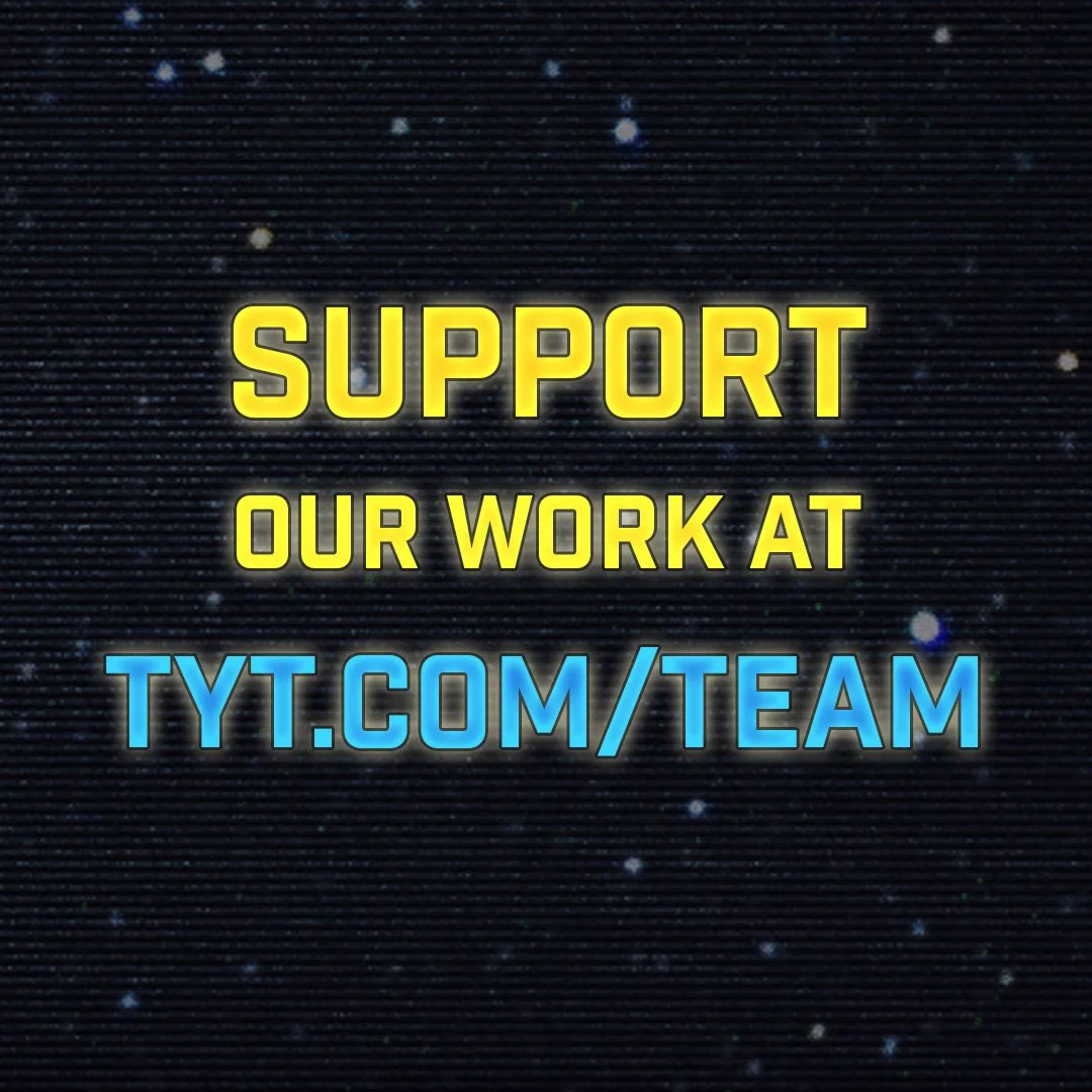
After the identity was approved, I extended the branding across social media graphics, website banners, YouTube artwork, merchandise, promotional graphics, fundraising campaigns, and other marketing materials, ensuring a consistent look throughout the campaign's year-long rollout.
Reflection
This project strengthened both my technical and collaborative skills. I learned new Photoshop techniques for chrome lettering, glitch effects, and lighting while gaining valuable experience navigating evolving creative direction and incorporating feedback from multiple sources.
Although the final design differed from my original concept, the process reinforced the importance of flexibility and designing toward project goals rather than personal preference.