

Annual Report Infographic
Transforming annual statistics into an engaging visual story for print, web, and social media
Final printed rack card used throughout the shelter, at community events, and adapted for digital platforms
Overview
Each year, Gloucester-Mathews Humane Society published an annual report highlighting the organization's impact. Previously, that information was shared primarily as text, making it easy to overlook. I was tasked with transforming the report's key statistics into a visually engaging infographic that could be distributed as a rack card, shared on social media, and featured on the organization's website.
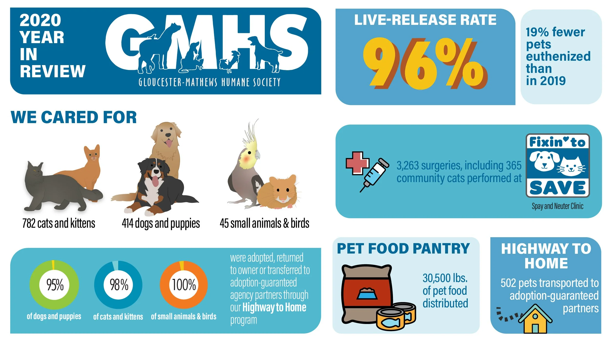
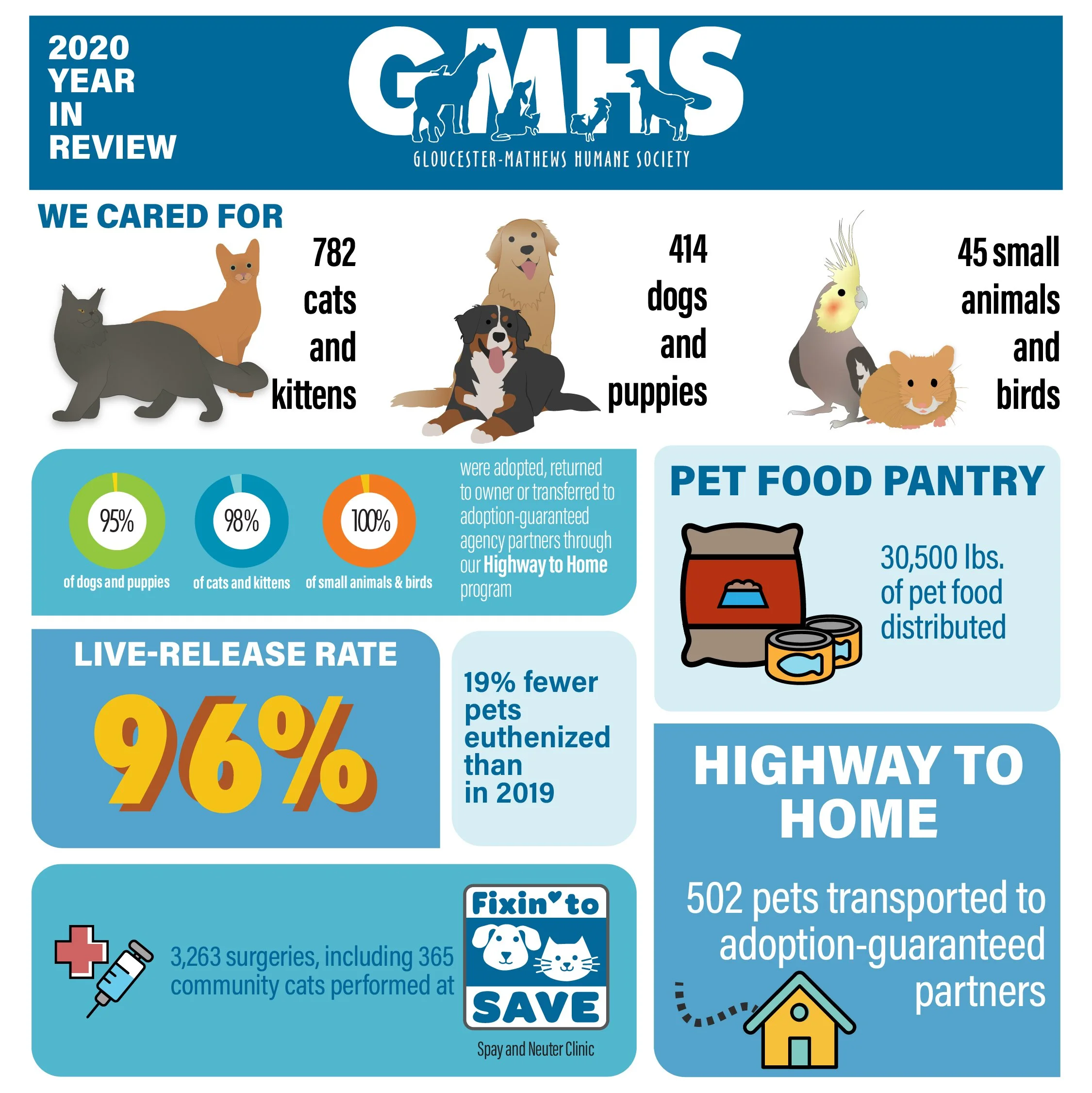
The infographic was adapted into platform-specific versions for social media and the organization's website, creating a consistent campaign across print and digital.
The Challenge
The goal was to communicate the shelter's accomplishments in a format that was informative, approachable, and easy for the public to understand. Working from a written report, I needed to prioritize the most meaningful statistics while designing a layout that encouraged readers to engage with the information. The piece also needed to work across multiple formats without losing clarity or visual impact.
The Solution
I organized the information into a clear visual hierarchy, leading with the organization's most impactful statistics before introducing supporting data. Bright colors, custom illustrations, icons, and bold typography helped transform numerical information into an engaging infographic while remaining easy to read. After completing the rack card, I adapted the design into social media and website graphics, creating a consistent visual campaign across both print and digital platforms. The infographic was successful enough that I was asked to update it again the following year.
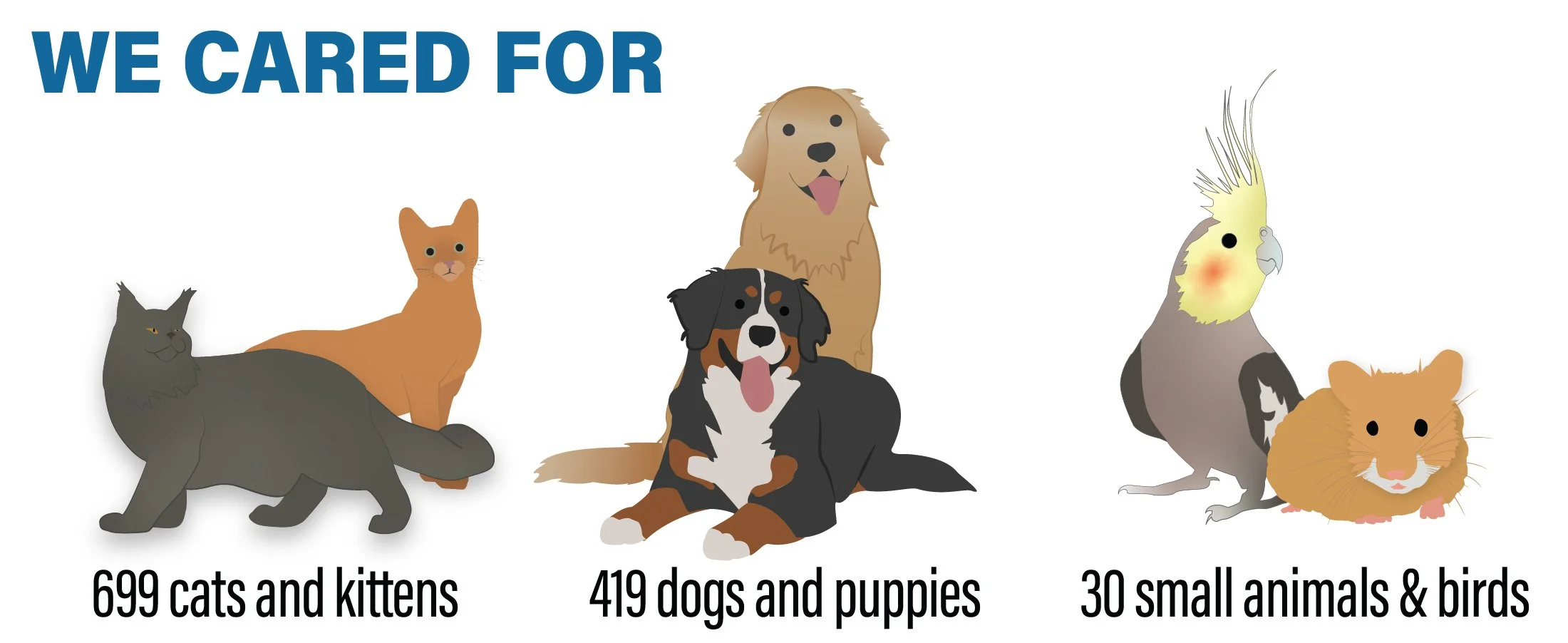
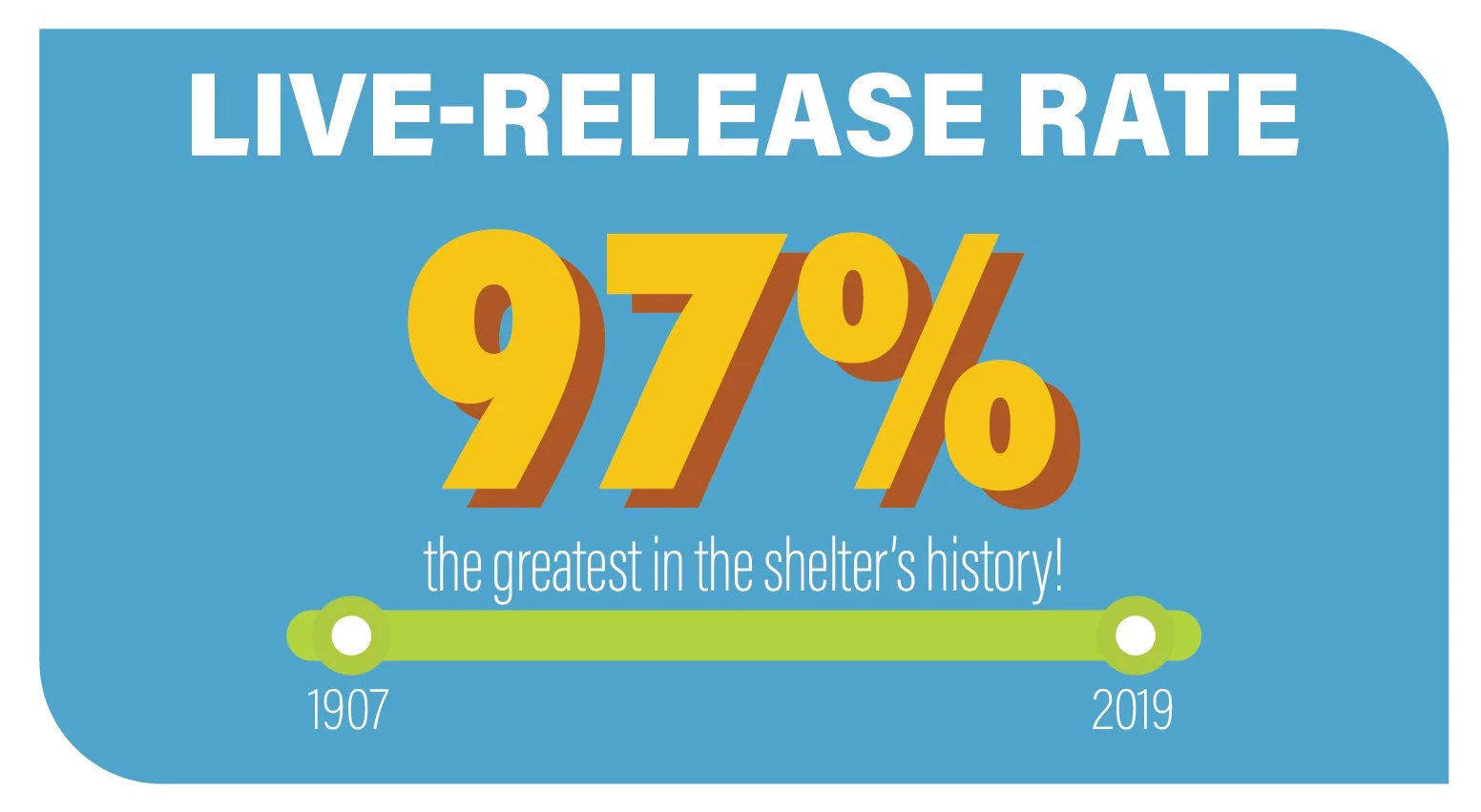
Bright colors, custom illustrations, icons, and strong visual hierarchy helped transform annual statistics into an engaging infographic
Reflection
This project introduced me to infographic design and strengthened my understanding of information hierarchy and data visualization. It challenged me to present complex statistics in a way that was both visually engaging and easy to digest. Looking back, I would refine some of the smaller typography for improved readability, but I'm proud of how effectively the final design communicates the organization's impact while demonstrating my illustration, layout, and Adobe Illustrator skills.
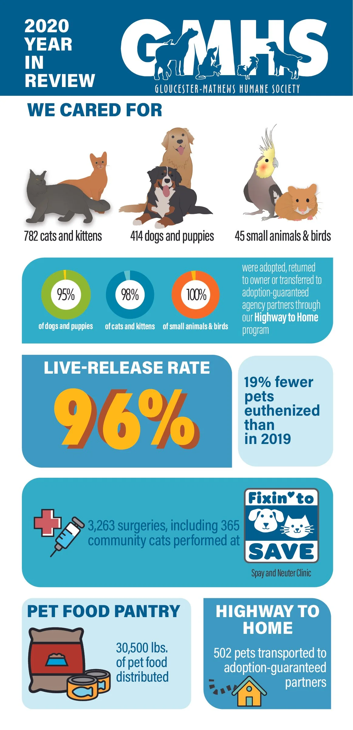
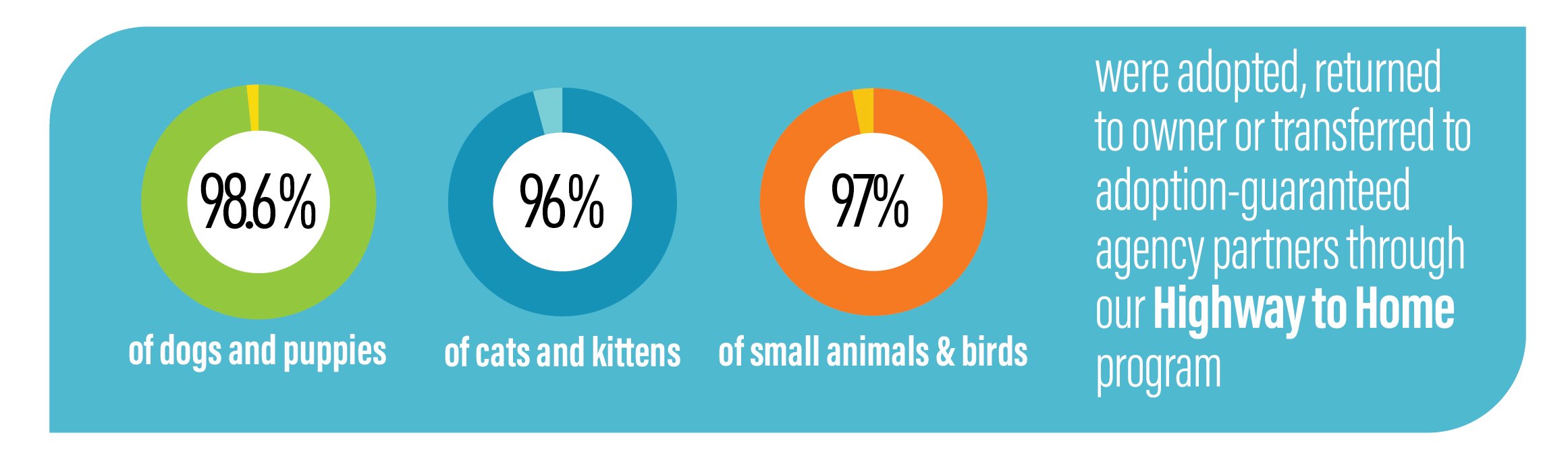
After the initial design proved successful, I was asked to update the infographic with the following year's statistics while maintaining the established visual style