
Fixin’ to Save
Creating a lasting identity for a nonprofit spay and neuter clinic
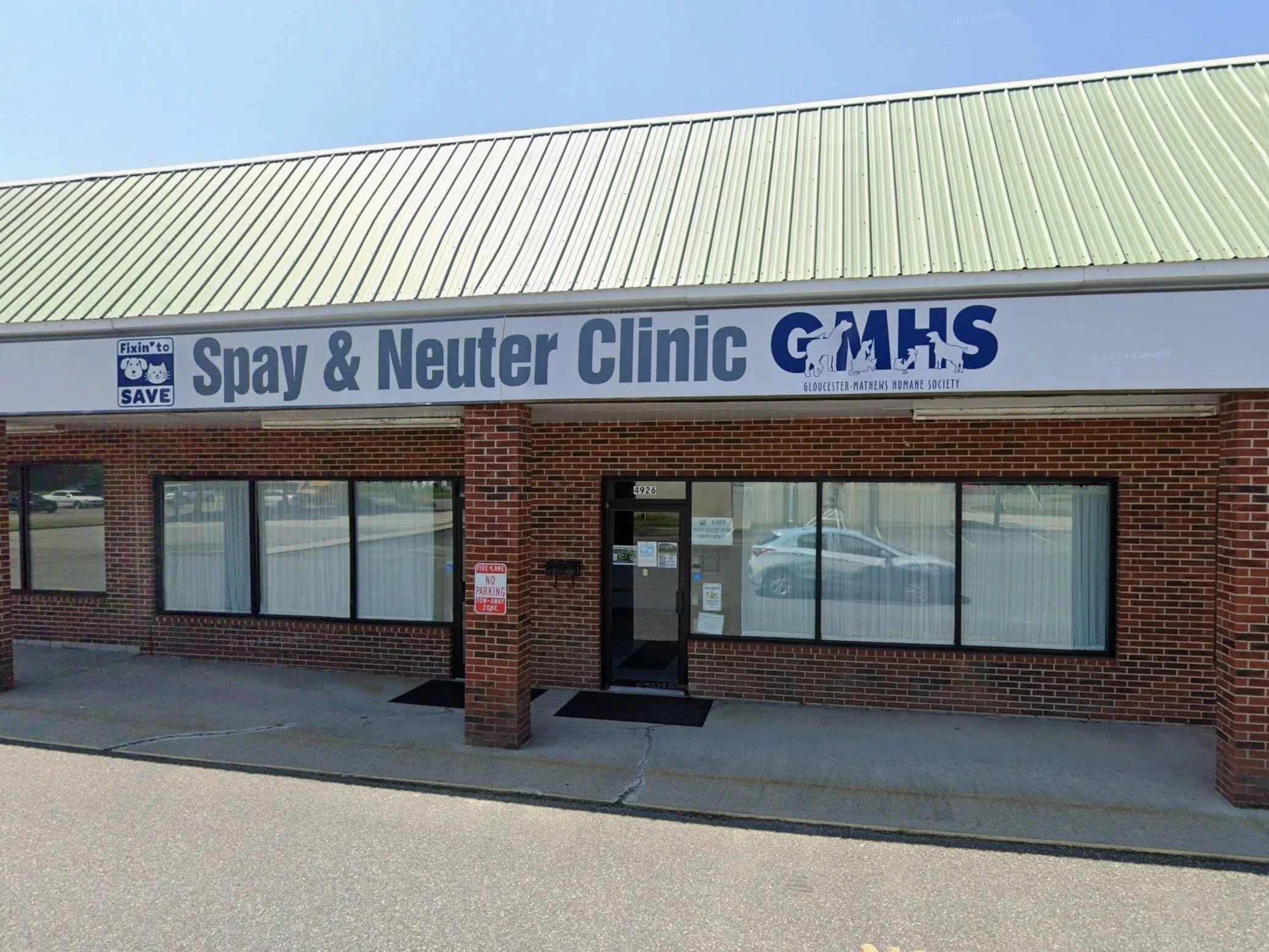
Final identity for the Fixin' to Save spay and neuter clinic
OVERVIEW
Fixin' to Save was a rebranding initiative for the Gloucester-Mathews Humane Society's low-cost spay and neuter clinic. Previously, the clinic operated as an extension of the shelter without its own visual identity. I was asked to create a logo that would help establish a recognizable, affable brand while remaining visually connected to the parent organization.
Role: Logo design and visual identity
Tools: Adobe Illustrator
Year: 2019
-
THE CHALLENGE
The goal was to create a fun, memorable identity that would make the clinic more approachable while reinforcing its connection to Gloucester-Mathews Humane Society. The logo needed to include the clinic's name and appeal to pet owners, all while fitting naturally alongside the shelter's existing branding.
THE SOLUTION
I explored several concepts featuring cats and dogs in different compositions before refining the strongest direction through feedback from the Executive Director. To maintain visual consistency with the shelter, I incorporated the organization's signature blue and white color palette and paired it with a rounded, friendly typeface that reflected the welcoming nature of the clinic. The final identity was designed to feel approachable, recognizable, and flexible enough for use across signage, print materials, business cards, the website, and social media.
REFLECTION
This project was one of my first opportunities to create a logo that would become a permanent part of an organization's public identity. More importantly, it taught me the value of design iteration. Working through feedback strengthened the final logo and reinforced that successful branding is about balancing personal creativity with client goals.
Today, the logo continues to be used on the clinic's signage, website, printed materials, and business cards.
THE CHALLENGE
Create a friendly, recognizable identity that could stand on its own while remaining connected to the GMHS brand.
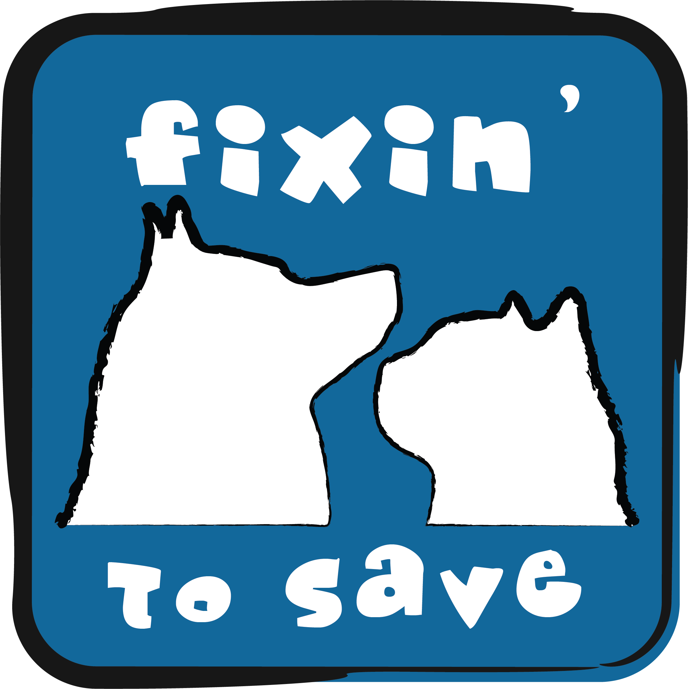
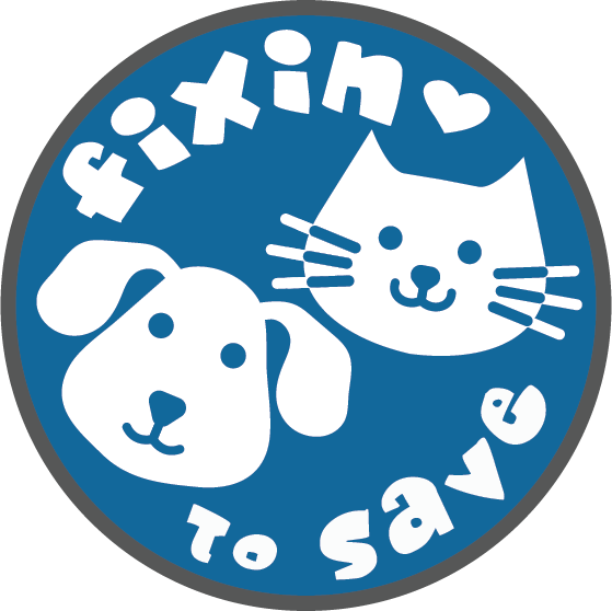
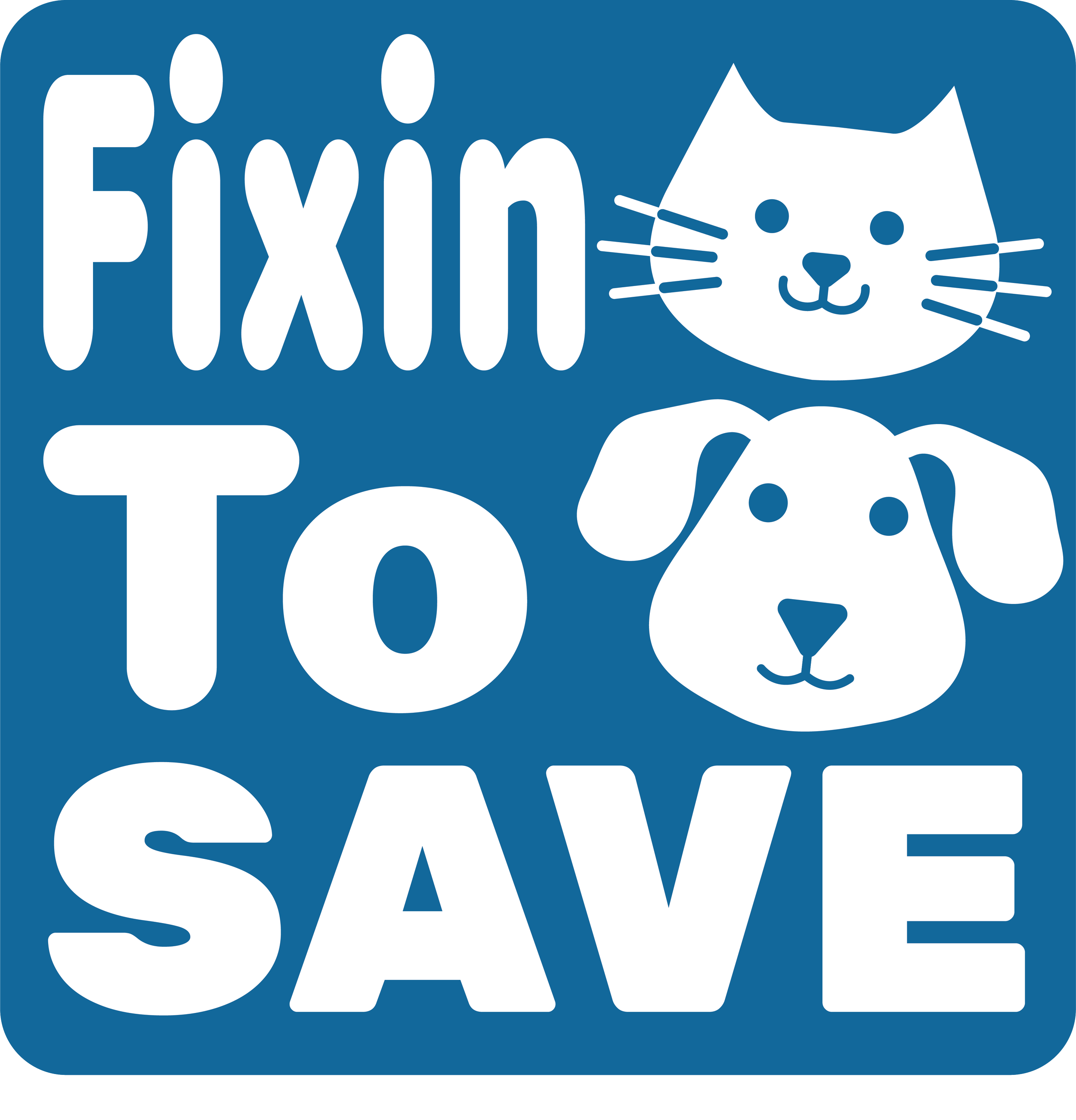
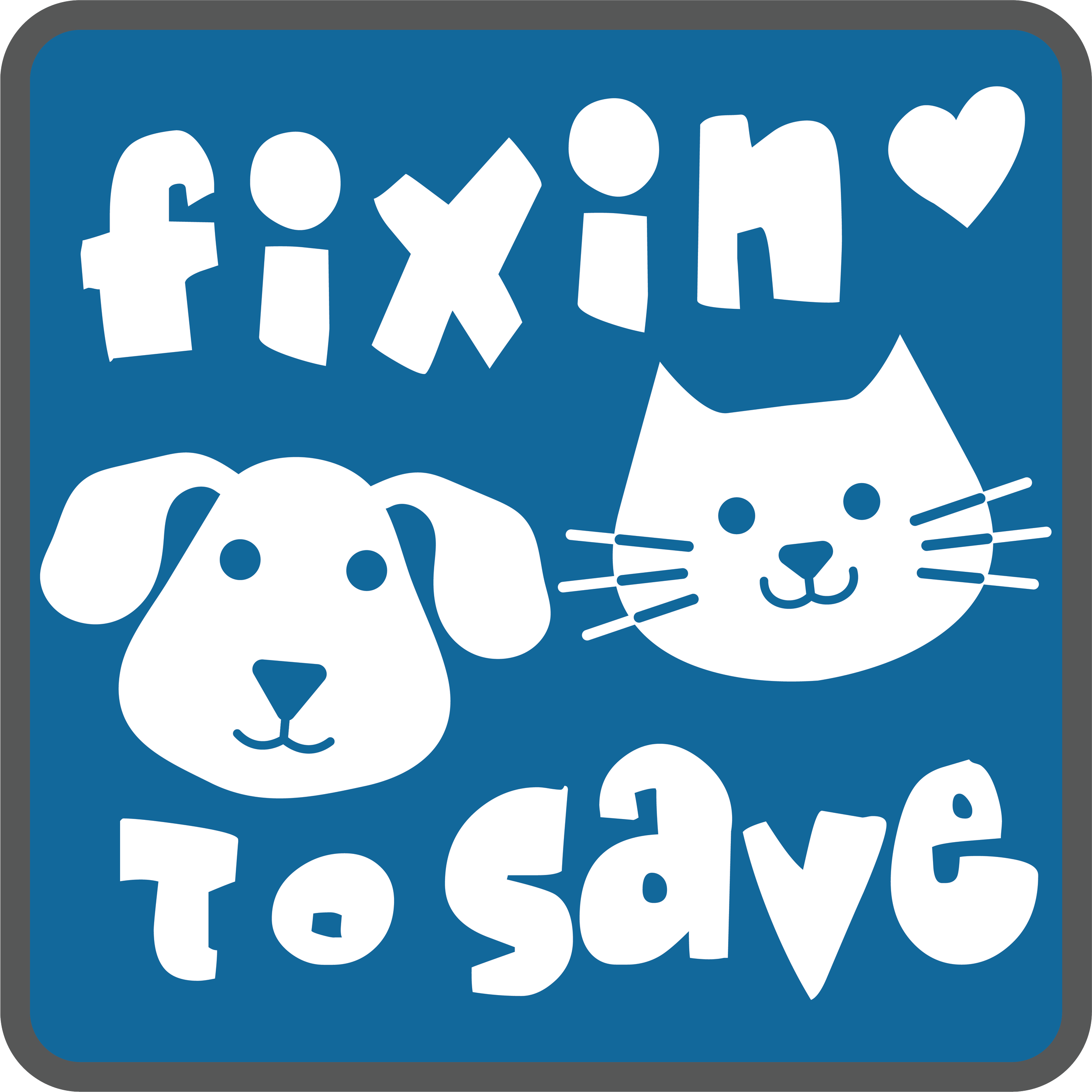
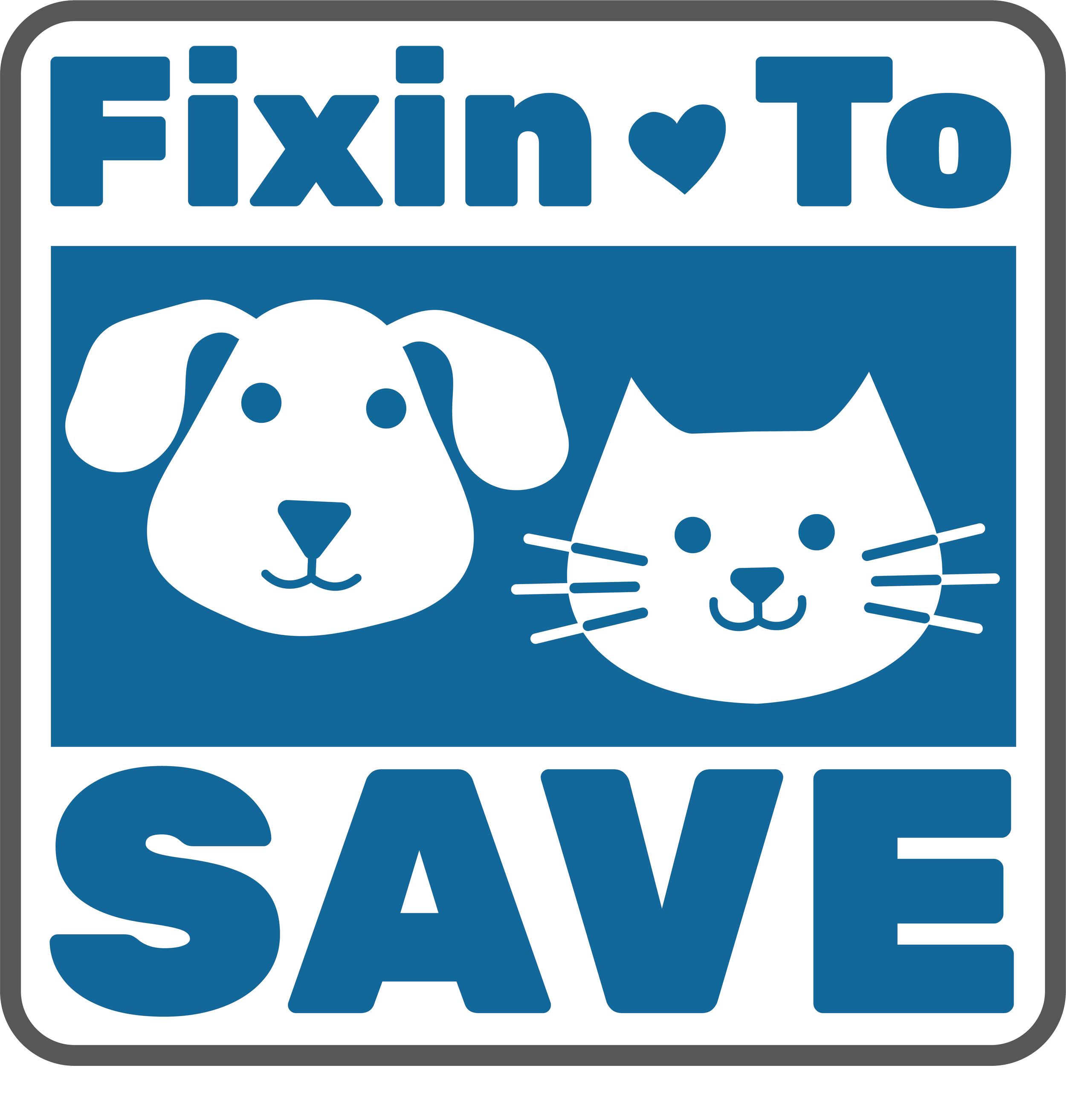
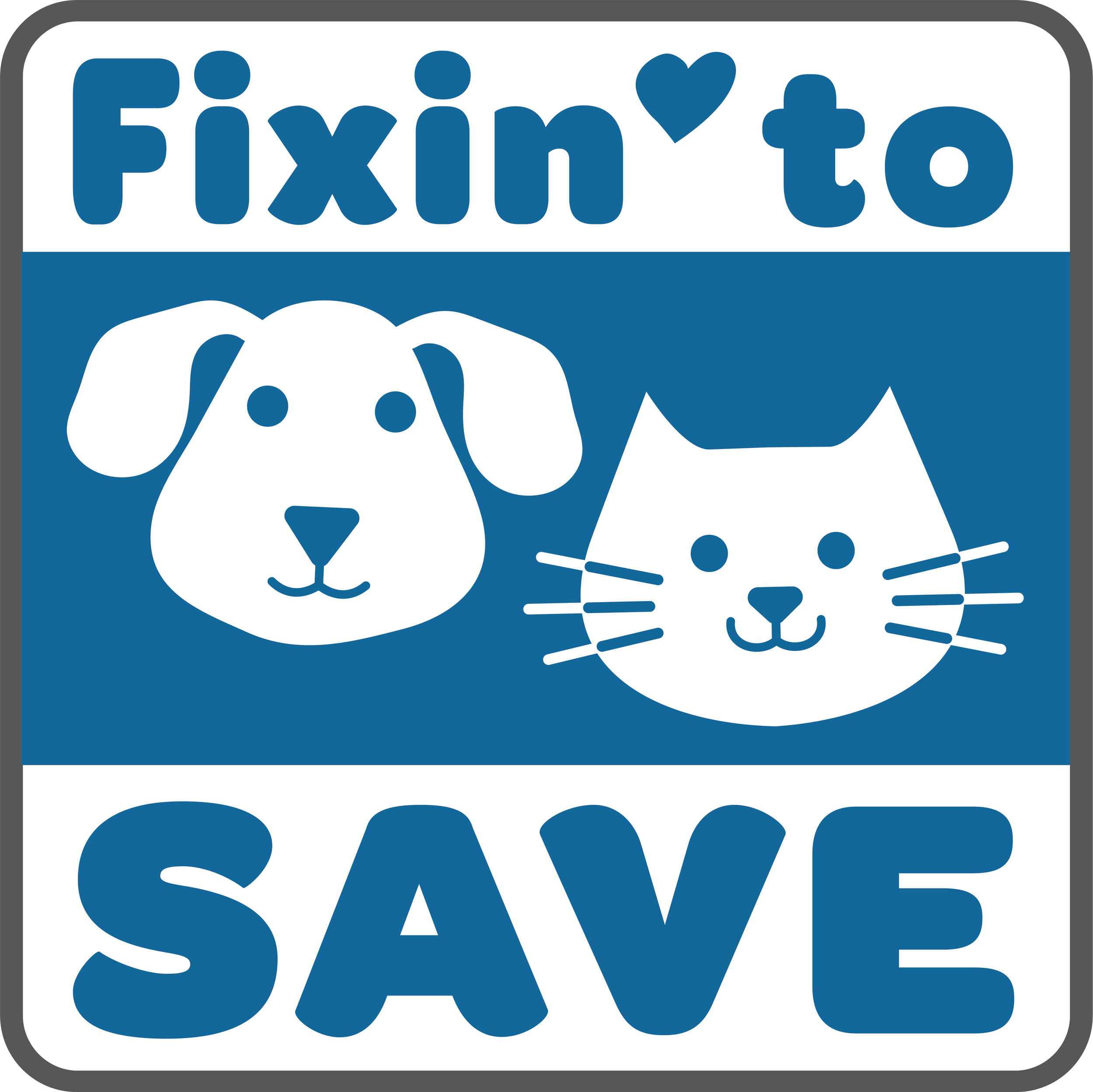
Multiple concepts were explored before refining the final mark after leadership feedback
THE SOLUTION
GMHS’s signature colors, friendly typography, and playful animal imagery created a distinct identity with a clear connection to the parent brand.
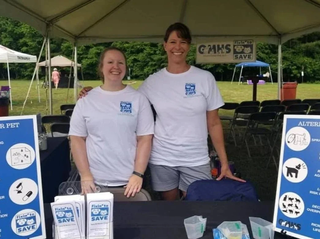
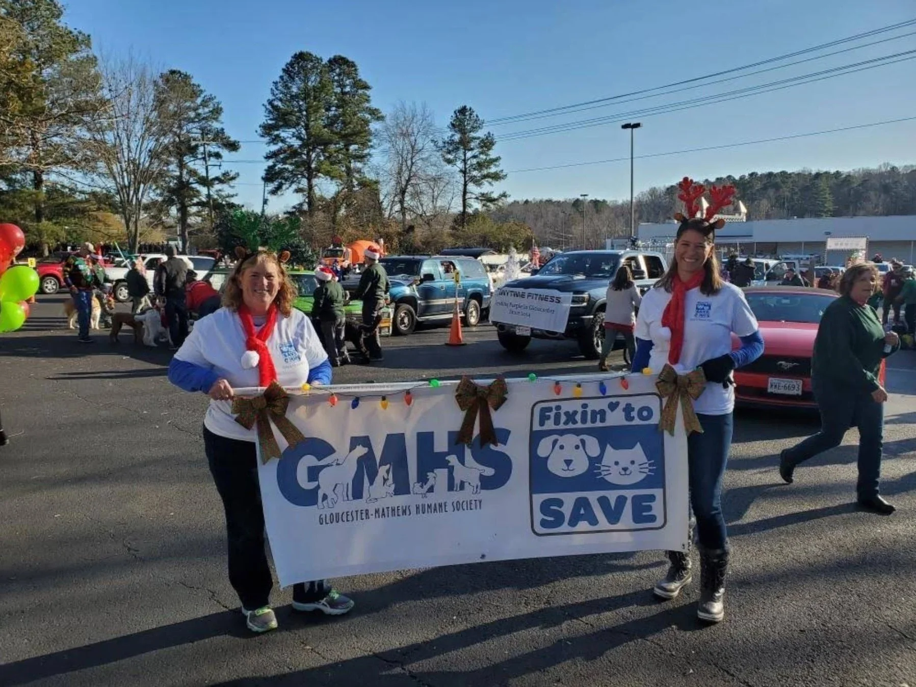
The identity extended across signage, print, and digital applications, creating a consistent brand for the clinic.
REFLECTION
The project reinforced how iteration and client feedback can strengthen a visual identity. Today, the logo continues to be used on the clinic’s signage, website, printed materials, and business cards.