
Dollars Not Daisies
Creating an illustration-driven merchandise design celebrating International Women's Day through a message of empowerment and equal pay
Overview
To celebrate International Women's Day, TYT's merchandise team commissioned a small collection of apparel focused on women's empowerment. Rather than creating a generic holiday design, my coworker and I developed concepts centered on equality and economic empowerment. Together we came up with the phrase "Dollars Not Daisies," reflecting the idea that meaningful recognition comes through equal pay and opportunity—not symbolic gestures alone.
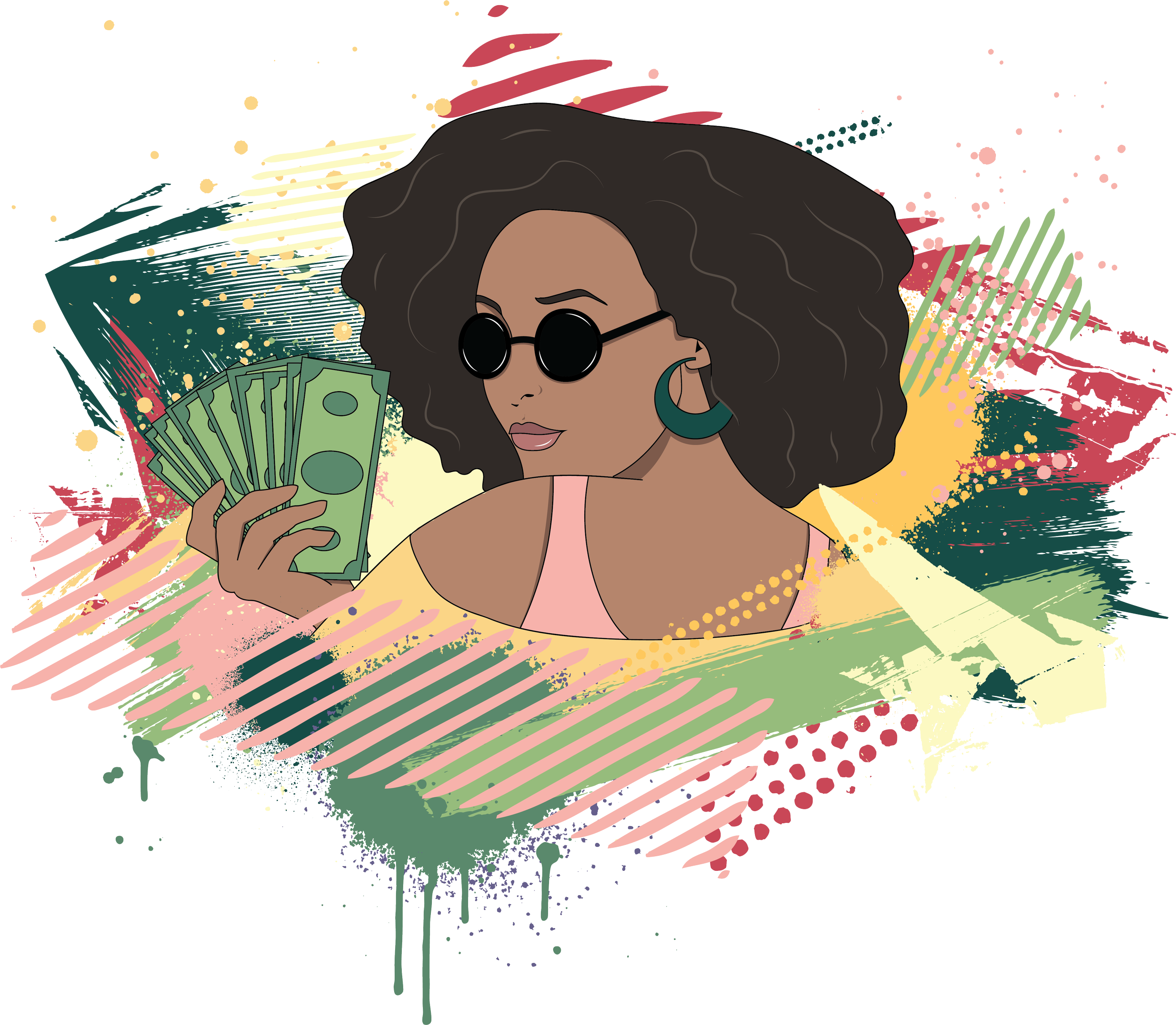
I designed an original illustration and merchandise layout that paired the slogan with a bold portrait, resulting in a graphic that felt confident, contemporary, and fashionable.
Final merchandise design created for TYT's International Women's Day collection, combining original illustration with a message centered on economic equality
The Challenge
The design needed to communicate a strong message while remaining visually appealing as apparel. Merchandise printing also required clean, graphic artwork without too many colors.
After brainstorming with my coworker, we landed on the phrase "Dollars Not Daisies." From there, I sketched the illustration, explored several visual directions, and presented multiple color palettes for review—including two versions inspired by Patrick Nagel's iconic illustration style. While I personally enjoyed the stylized concepts, the merchandising team selected a more natural color palette, which ultimately made the message feel more approachable and broadly appealing.
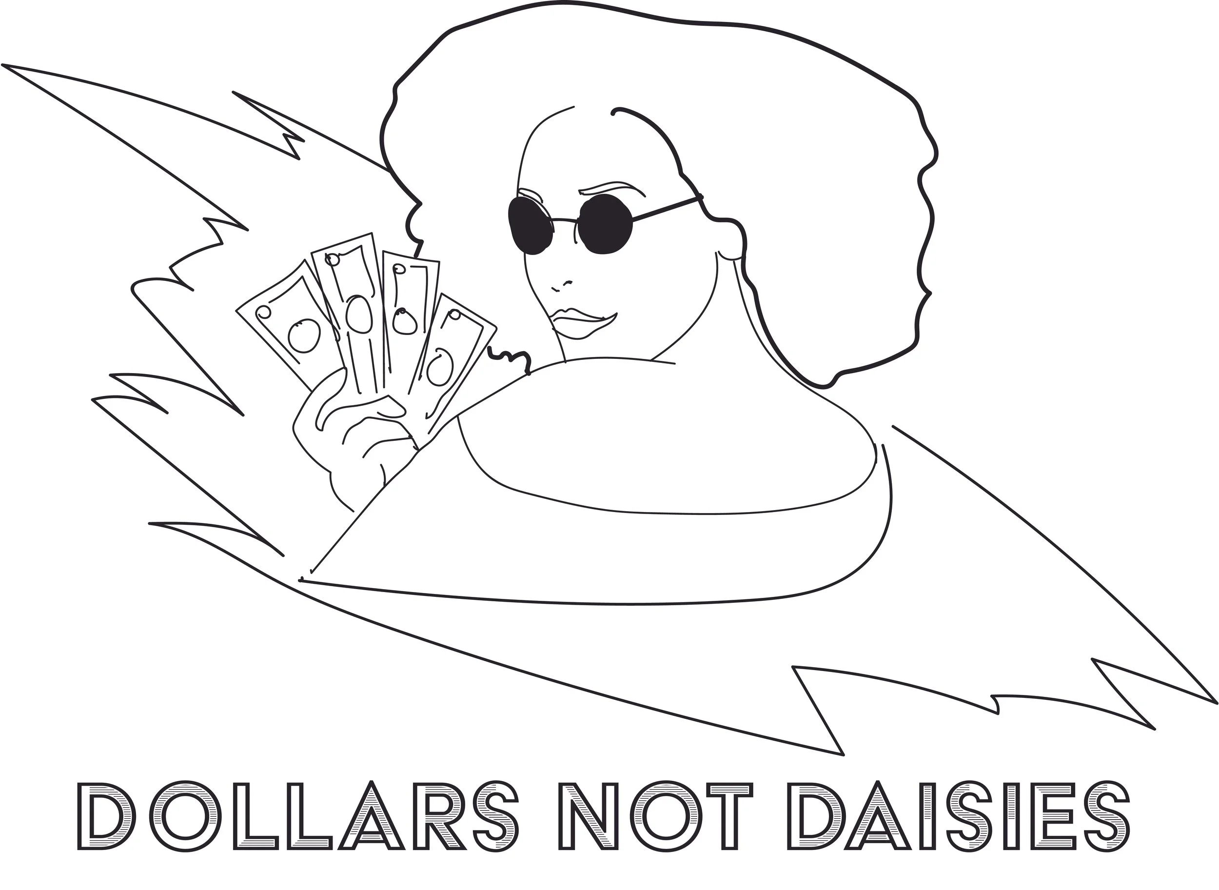
The concept began as a hand-drawn sketch in Procreate before being refined into clean vector artwork in Adobe Illustrator
The Solution
I began by sketching the concept in Procreate before rebuilding the illustration as vector artwork in Adobe Illustrator. The composition depicts a confident woman holding dollar bills—a visual metaphor for knowing one's worth and advocating for equal pay.
To complement the illustration, I created a simple typographic treatment for the slogan using an inline sans serif typeface, printed as a subtle pocket graphic while the full illustration appeared on the back of the sweatshirt. Spray-paint-inspired textures and graphic accents added energy without overwhelming the artwork, creating a design that balanced activism with everyday wearability.
The finished design was produced as a cropped sweatshirt in multiple colorways and released through the ShopTYT merchandise store, where it remains available today.


I explored several color directions before the merchandising team selected the final natural palette. The alternate versions were inspired by the bold graphic style of illustrator Patrick Nagel
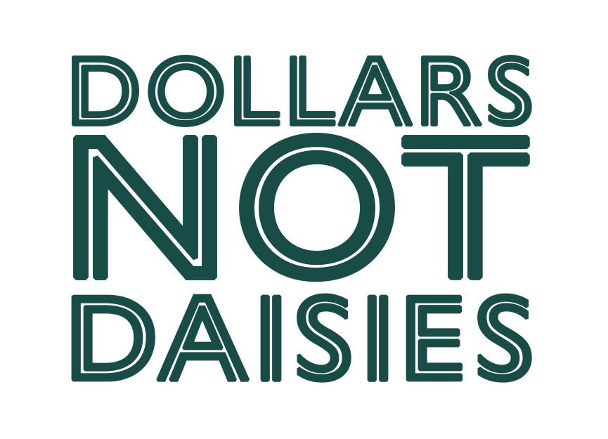
Final wordmark for the front of the shirt.
Reflection
This project reminded me that good merchandise starts with a strong concept. While I'm proud of this illustration itself, I'm equally proud of the collection as a whole that was the result of collaborating with my coworker.
If I revisited the project today, I'd probably refine the tagline further, but I still think the illustration successfully communicates confidence, independence, and self-worth. It's also one of the few opportunities I had at TYT to combine illustration, typography, and apparel design into a single piece, making it a unique addition to my portfolio.
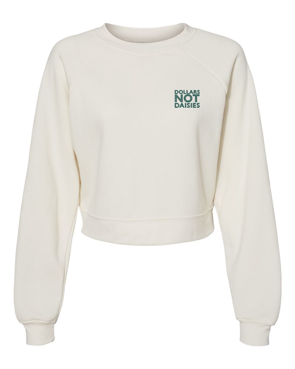
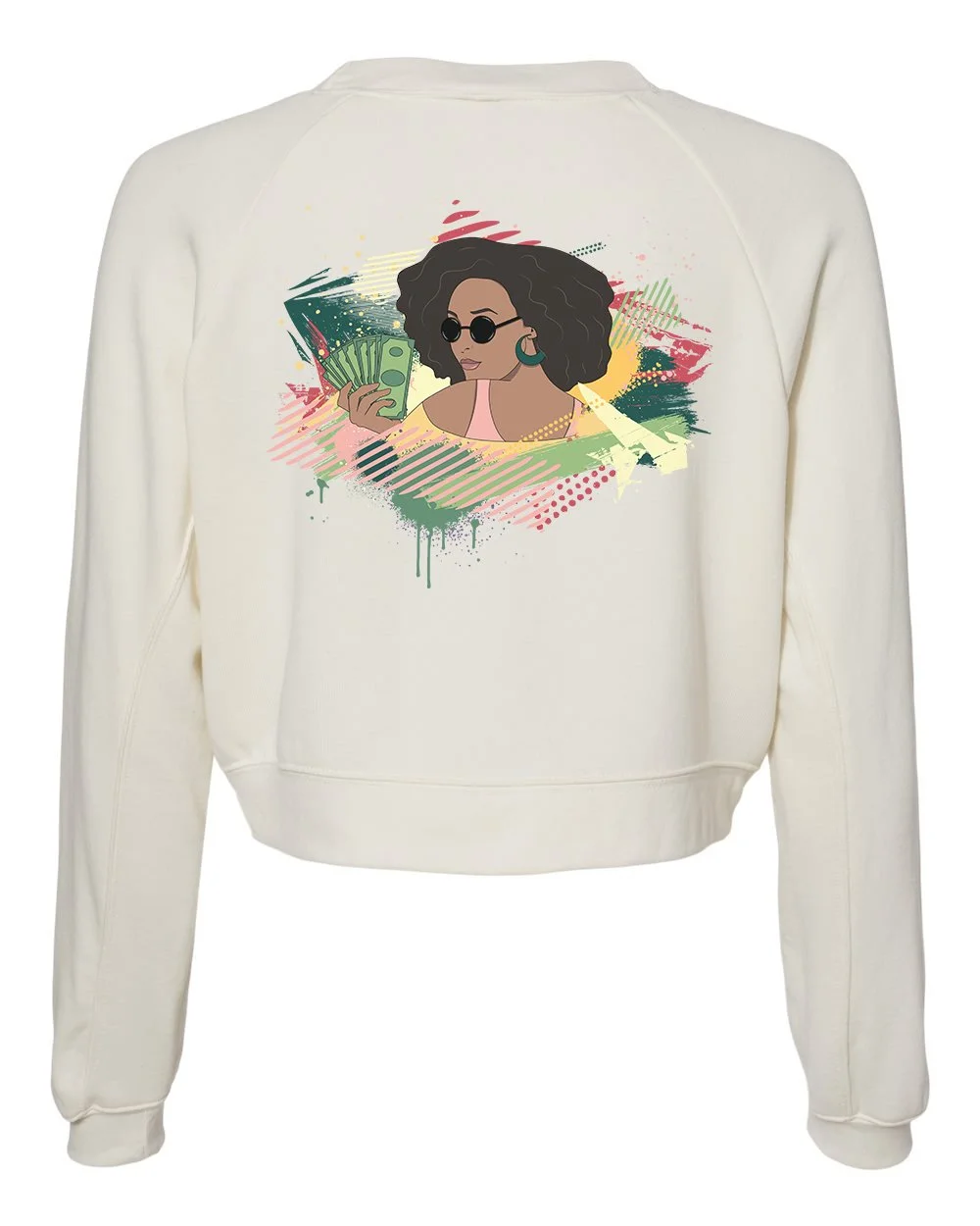
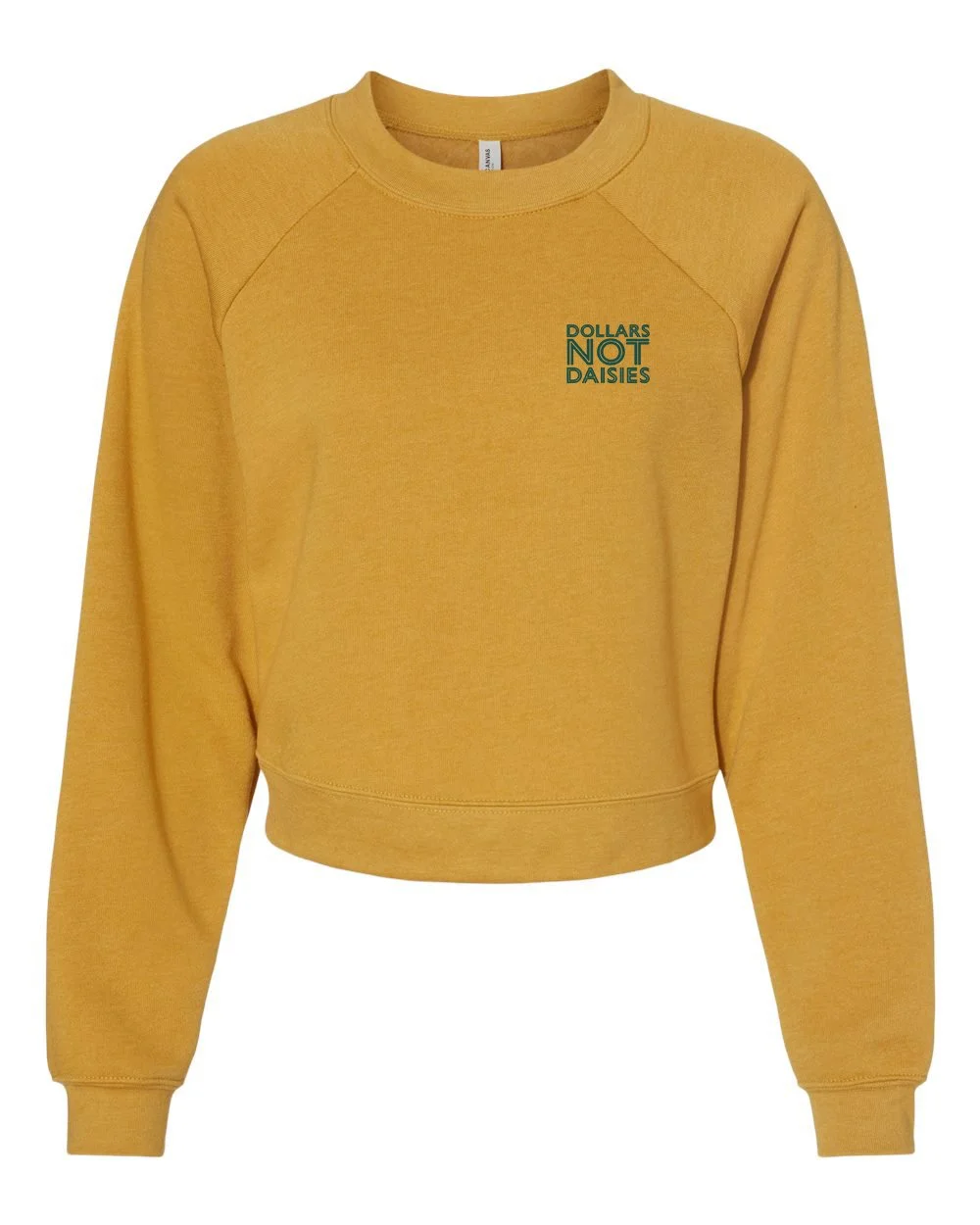
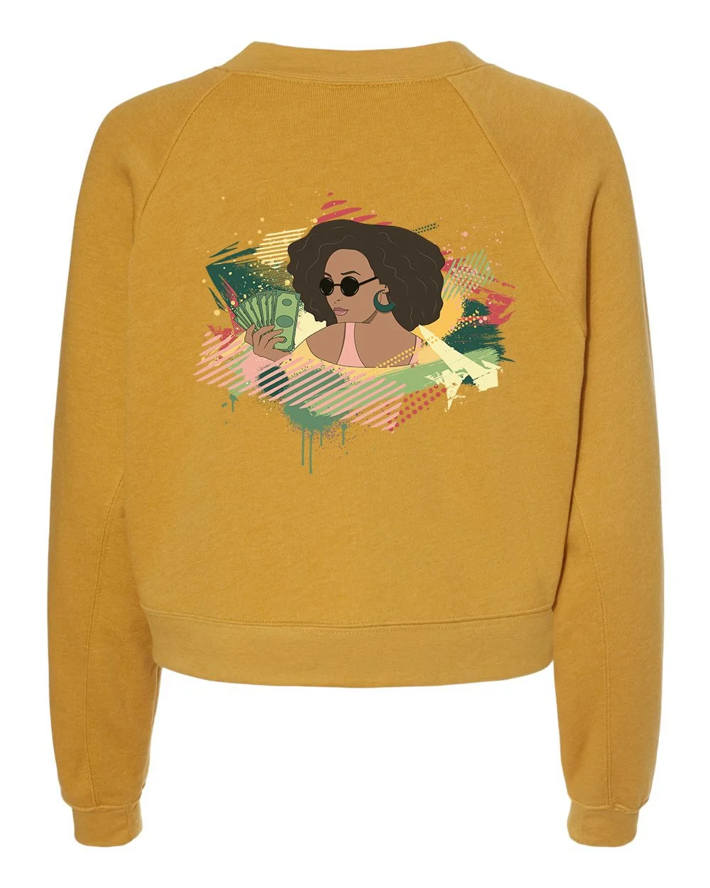
The completed artwork was adapted for cropped sweatshirts and released through the ShopTYT merchandise store, translating the illustration from concept to wearable product